
The landscape of social media is currently undergoing its most significant structural shift since the inception of the "walled garden" model popularized by Facebook and Twitter. At the heart of this transformation is the Fediverse—a collection of interconnected, independent servers that communicate via the ActivityPub protocol. While the concept of decentralized social networking has existed for over a decade, it only entered the mainstream consciousness following the volatile acquisition of Twitter by Elon Musk. Mastodon, the leading software provider in this space, became the primary beneficiary of that exodus. However, as the initial dust settled, the platform faced a sobering reality: decentralization is ideologically superior to many users, but its inherent complexity creates a formidable barrier to entry for the average consumer.
Recognizing this "complexity gap," Mastodon has embarked on an ambitious journey to modernize its user interface and experience. The latest phase of this evolution, announced this week, focuses on a comprehensive overhaul of user profiles. This update is not merely a cosmetic "reskinning" but a strategic attempt to align the platform’s usability with the expectations of mainstream users who are increasingly migrating from X (formerly Twitter) and Meta’s Threads. By streamlining how users present themselves and how they interact with others’ content, Mastodon is signaling its intent to move beyond its niche, tech-savvy origins and become a viable home for organizations, journalists, and casual creators alike.

To understand the weight of these changes, one must first acknowledge the friction that has historically plagued the Mastodon experience. Unlike centralized platforms where a single entity controls the onboarding, algorithm, and identity management, Mastodon requires users to navigate a fragmented ecosystem. Choosing a server, understanding the "double-at" (@user@server) handle format, and deciphering the difference between local and federated timelines are all hurdles that contribute to user churn. Current data suggests that while Mastodon saw a surge to over one million monthly active users during the peak of the Twitter transition, that number has since stabilized around 800,000. This plateau suggests that while the platform is excellent at attracting "refugees," it has struggled with long-term retention. The new profile redesign is a direct response to this retention challenge.
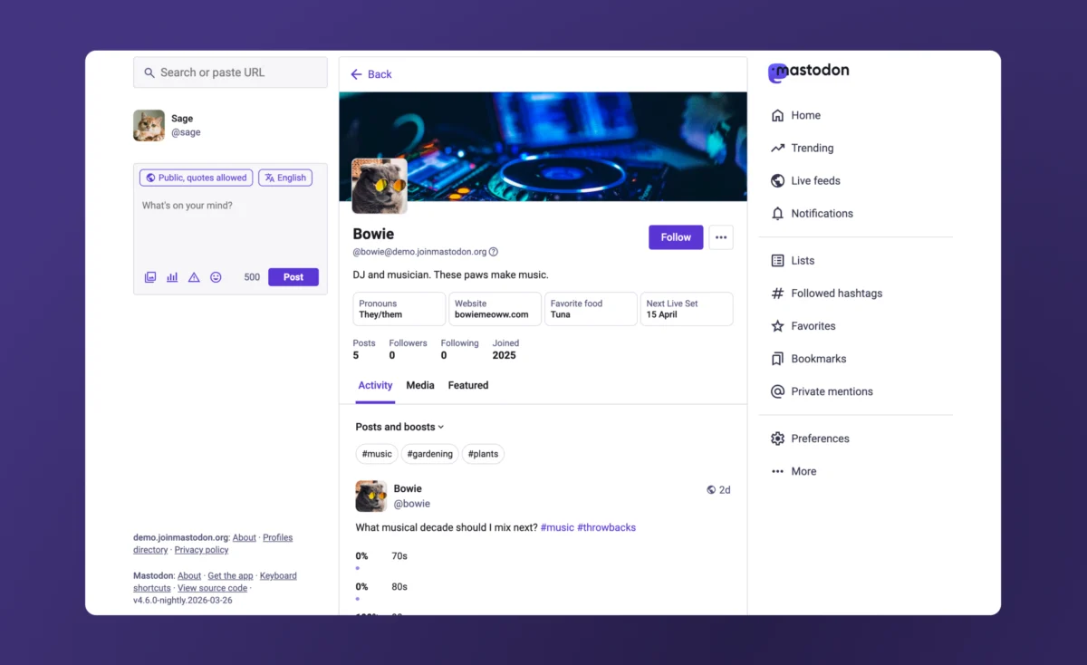
The centerpiece of the revamp is the reimagined "Activity" tab. In previous iterations, Mastodon mirrored the traditional social media layout by offering separate views for "posts" and "posts and replies." While familiar to power users, this binary choice often obscured the full breadth of a user’s contributions. The new design replaces this with a singular, unified Activity tab equipped with a sophisticated filtering menu. Users and visitors can now toggle specific content types on or off—such as replies or "boosts" (Mastodon’s equivalent of a repost)—allowing for a customized viewing experience. This shift represents a move toward "user-centric curation," where the visitor has more agency over how they consume a profile’s history without the platform relying on an opaque algorithm to make those decisions.
Furthermore, the integration of hashtags at the top of the Activity tab is a masterstroke in information architecture. On a decentralized network, hashtags are the primary connective tissue for discovery. By allowing visitors to click a tag directly on a profile to filter that specific user’s posts, Mastodon is transforming the profile from a chronological list into a searchable personal archive. For organizations and researchers who use the platform to document specific projects or themes, this functionality provides a level of utility that centralized competitors currently lack.

Another significant point of contention among the Mastodon community has been the "pinned posts" carousel. While intended to highlight evergreen content, many users found the horizontal scrolling mechanism to be clunky and visually disruptive. The redesign ditches the carousel in favor of a more elegant solution: a single featured post is displayed prominently, with a "View all pinned posts" button that expands to show the rest. This change reflects a broader design philosophy seen throughout the update—reducing visual clutter to prioritize the most relevant information.
Perhaps the most critical update for mainstream adoption is the introduction of educational "friction." Usually, designers try to remove friction, but Mastodon is using it to bridge the knowledge gap regarding its handle system. Because Mastodon is federated, a user’s identity is tied to their specific server. This results in the "double-at" handle, which remains a source of confusion for those coming from the "single-at" world of Threads or X. The new profile interface includes an informational pop-up that explains exactly what the handle represents and how it functions across the Fediverse. This proactive education is essential for building a user base that understands the underlying technology they are using, which in turn fosters a more resilient community.
The redesign also grants users unprecedented control over their digital storefront. Creators, in particular, will benefit from the ability to hide the "Media" or "Featured" tabs. More importantly, the new "Media" tab can be configured to exclude replies, essentially turning it into a clean portfolio of the user’s images and videos. In an era where many artists are fleeing centralized platforms due to concerns over AI training and algorithmic suppression, providing a clean, professional space to showcase work is a significant competitive advantage for Mastodon.

On the technical and administrative side, the update introduces a unified editing interface. Previously, managing various aspects of a profile—such as custom fields, links, and verification—required navigating through multiple sub-menus. The new centralized settings hub allows for "one-stop" management of a user’s digital identity. This includes the ability to manage "featured hashtags" (with the system now offering intelligent suggestions) and, crucially, the ability to edit these fields directly from iOS and Android devices. For a platform that was once criticized for its "web-first, mobile-second" mentality, the parity between the desktop and mobile experience is a vital step toward modern social media standards.
The implications of this redesign extend far beyond aesthetics. We are currently witnessing a "protocol war" between ActivityPub (used by Mastodon and Threads) and the AT Protocol (used by Bluesky). While Bluesky has gained momentum by offering an experience that feels almost identical to the old Twitter, Mastodon is betting that users will eventually value the robustness of a truly decentralized, non-corporate standard. However, to win that bet, Mastodon must prove that "decentralized" doesn’t have to mean "difficult."
Industry analysts suggest that the success of the Fediverse depends on its ability to attract "anchor tenants"—large organizations, government agencies, and high-profile public figures. These entities require a level of profile customization and verification that has historically been the domain of centralized platforms. Mastodon’s move to make link verification more prominent and easier to set up is a direct play for these institutional users. Unlike X, which has moved toward a "pay-for-verification" model that many feel has diluted the meaning of the "blue check," Mastodon’s verification is based on technical cross-referencing (rel="me" links). It is a meritocratic, free system that establishes credibility through ownership of external domains. By bringing this feature out of the shadows and into the main profile settings, Mastodon is positioning itself as the "adult in the room" of social media verification.

Looking ahead, the rollout of this redesign with the upcoming Mastodon 4.6 update will be a litmus test for the platform’s future. The changes will first be battle-tested on the flagship mastodon.social server and among those running nightly builds before being distributed to the thousands of independent servers that make up the network. This staged rollout is a hallmark of the decentralized model, ensuring stability across a diverse array of hosting environments.
As we move deeper into the 2020s, the "enshittification" of centralized social media—a term coined by Cory Doctorow to describe the inevitable decline of platforms as they prioritize monetization over user value—is driving a slow but steady migration toward open standards. Mastodon’s latest revamp suggests that the platform is finally ready to meet those migrants halfway. By marrying the ideological benefits of the Fediverse with the polished user experience of a modern tech product, Mastodon is making its strongest case yet that the future of social networking is not just decentralized, but actually enjoyable to use. The challenge remains whether 800,000 users can grow into 80 million, but with these barriers to entry finally crumbling, the path to the mainstream has never been clearer.
