
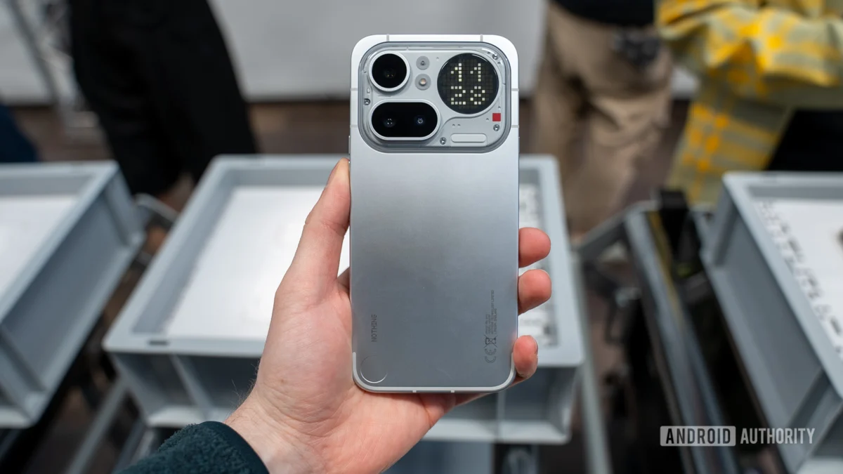
The trajectory of modern smartphone aesthetics has long been characterized by iterative refinement rather than radical departures. For years, manufacturers have grappled with the twin pressures of maximizing screen real estate and integrating complex camera arrays, often resulting in a visual homogeneity across flagship devices. Into this established, somewhat predictable landscape steps Nothing, the ambitious challenger brand, whose latest mid-range offering, the Nothing Phone 4a Pro, has generated significant buzz—not just for its specifications, but crucially, for its visual identity. Following the initial reveal, a community-driven poll gauged consumer reaction to the device’s distinctive physical form factor, and the results indicate a resounding endorsement of the company’s design philosophy.
The internal telemetry from a recent reader survey, which gathered nearly 1,900 distinct votes over several weeks, paints a clear picture of market approval. An overwhelming majority—specifically, 85.2% of respondents—expressed positive sentiment regarding the design language of the Nothing Phone 4a Pro. This level of consensus in the often-skeptical tech community suggests that Nothing has successfully navigated the precarious balance between differentiation and mass appeal, particularly within a more accessible price segment.
To understand the significance of this approval rating, one must contextualize Nothing’s brand positioning. Founded by Carl Pei, the company was established explicitly to inject novelty and personality back into a stagnant hardware market. Their initial product lines utilized transparent elements and the unique Glyph Interface—distinctive features that immediately set them apart. However, as the company matures and attempts to scale its offerings, the challenge lies in maintaining that distinctiveness without alienating a broader consumer base looking for reliable, well-executed technology. The 4a Pro appears to represent a successful calibration of this balancing act.
The feedback collected via community commentary underscores the specific elements resonating with users. One respondent, identifying as ‘OldeIronsides,’ noted that the design felt "fresh, and still retains that Nothingness even with a case." This comment is particularly insightful. In an era where protective casings are ubiquitous, a phone’s aesthetic value is often nullified moments after unboxing. The fact that the 4a Pro’s core design characteristics—likely its signature transparent back panel and revised structural elements—are perceived as resilient enough to transcend the addition of a protective layer speaks volumes about the strength of the visual blueprint.
Furthermore, the observation from user ‘Radiohedgefund’ highlights a critical contemporary paradox in mobile device design: "We live in a strange timeline where the back of a phone, the bit that faces away from you or is otherwise buried in a case has become a feature." This sentiment acknowledges that the back panel has evolved from a purely utilitarian surface into a primary canvas for branding and technological expression. The 4a Pro’s design seems to have leveraged this trend effectively, offering a compelling visual signature that users feel warrants protection and display, even if only intermittently. This contrasts sharply with competitors who often reserve their most elaborate rear designs for their premium flagship models, leaving mid-range devices visually muted.
Conversely, the dissenting opinions, though significantly outnumbered, provide crucial counterpoints for product development analysis. Approximately 13.3% of participants registered disapproval of the 4a Pro’s aesthetic. User ‘superchecker13’ articulated this dissatisfaction by claiming the device "lost the uniqueness and looks like every single other phone. Its not beautiful, its boring. It does what everyone does." This critique suggests a segment of the audience values the extreme, almost experimental design language of Nothing’s earliest products above all else. For these early adopters, the perceived simplification or streamlining of the design might translate into conformity, undermining the brand’s core promise of disruption.
This divide in perception—between those embracing a more mature, yet distinct, design evolution and those desiring continued radicalism—is a common challenge for growing technology firms. It mirrors historical debates in automotive design or fashion, where initial boundary-pushing products must eventually evolve toward broader market acceptance while retaining their original ethos.
The context of this success is also vital when considering Nothing’s recent product history. The device follows the launch of the Nothing Phone 3, which, according to critical consensus, presented a more visually contentious design, particularly concerning the placement and arrangement of its rear camera modules, which some reviewers found haphazard or overly abstract. The positive reception to the 4a Pro’s design suggests that consumers may have preferred a more cohesive, perhaps subtly refined, aesthetic direction than what was offered in the Phone 3. This indicates that Nothing’s design team has successfully course-corrected, or perhaps that the 4a Pro’s specific mid-range positioning allowed for a design language that inherently appeals to a wider demographic without compromising core brand identity.
Industry Implications and Design Leadership
The overwhelming positive response to the Nothing Phone 4a Pro carries significant implications for the broader smartphone industry, particularly regarding the mid-range segment. For years, manufacturers targeting the sub-$600 category often defaulted to generic plastic or glass backs, minimalist camera bumps, and muted color palettes to minimize production costs and appeal to the largest possible audience. Nothing, by achieving high aesthetic marks in this segment, effectively raises the bar for design expectation among budget-conscious consumers.
If the 4a Pro can deliver compelling specifications at a competitive price point while simultaneously offering a visually superior experience, it forces established players like Samsung, Xiaomi, and even Google (with its ‘a’ series) to re-evaluate their approach to mid-tier industrial design. Consumers are demonstrating that they are unwilling to accept aesthetic compromise simply because they are not purchasing a top-tier flagship. The "cheap look" is becoming increasingly unacceptable.
This phenomenon aligns with a broader trend observed in consumer electronics: design is no longer merely a superficial layer; it is intrinsically linked to perceived value and user experience. A well-designed mid-range phone can cultivate stronger brand loyalty than a poorly executed flagship, as the former often serves as a consumer’s primary, long-term interaction point with the brand ecosystem.
From an expert design analysis perspective, the success likely stems from Nothing’s commitment to visual coherence. Their design language seems rooted in transparency, precision engineering, and a deliberate use of contrasting textures or materials (such as the interplay between the frame and the back panel). This approach is structurally different from the "glass sandwich" approach favored by many competitors. By focusing on the internal structure becoming visible—a mechanical transparency—they create depth and complexity that is hard to replicate cheaply, yet they have managed to embed this high-concept design into a more affordable chassis.
Future Trajectories and Design Evolution
The resounding success of the 4a Pro’s design sets a clear mandate for Nothing’s future product planning. The expectation now is that this aesthetic direction—one that is distinctly Nothing, yet more universally appealing than previous iterations—will be maintained, if not further iterated upon, across future product lines, including successors to the flagship series.
The data suggests that the integration of the Glyph Interface, or elements derived from it, remains a powerful differentiator. If the 4a Pro design allows for the retention of key Nothing signatures while streamlining the overall silhouette, this suggests a maturation of the brand’s industrial design vocabulary. Future trends in mobile hardware are already pointing toward modularity and sustainability, and Nothing’s existing design foundation, which emphasizes visible mechanics, could prove advantageous in future efforts to create repairable or upgradable devices. A design that invites closer inspection is more likely to sustain consumer interest through multiple hardware cycles.
Conversely, the small percentage of detractors serves as a vital quality control measure. The critique that the design has become "boring" implies that Nothing must avoid the trap of designing for the median. True innovation often courts polarization initially. The challenge for the design leadership will be to find the next visual innovation—the next iteration of the Glyph, or a new material science breakthrough—that satisfies the 85% while reigniting the excitement for the 13%. This usually involves pushing the boundaries of functionality within the aesthetic shell, perhaps integrating new sensor technologies or leveraging advanced haptics in ways that complement the existing visual structure.
In conclusion, the quantitative data from the community survey provides compelling evidence that Nothing has struck a successful chord with the Nothing Phone 4a Pro design. By offering a visually arresting yet functionally grounded aesthetic, the company has not only validated its design philosophy but has also established a new benchmark for visual expectation within the competitive mid-range smartphone market. For a company striving to become a significant player, this level of immediate, positive user feedback on core industrial design is an invaluable asset, signaling market readiness for their next evolutionary steps. The future of the brand appears aesthetically bright, provided they continue to nurture this hard-won user affinity for distinctiveness.
