
The latest iteration of Google’s mobile ecosystem, Android 17 Beta 3, has officially landed, marking a pivotal shift in the platform’s development cycle. While earlier builds in the testing phase were characterized by under-the-hood stability tweaks and incremental security patches, this third release signifies a departure toward tangible user experience enhancements. Having spent an intensive week stress-testing the software on a Pixel 10 Pro Fold, it is clear that Google is finally addressing long-standing friction points in the interface. This update is not merely a collection of minor UI adjustments; it represents a thoughtful refinement of how users interact with their devices on a granular level.
The Return of Floating Multitasking: App Bubbles
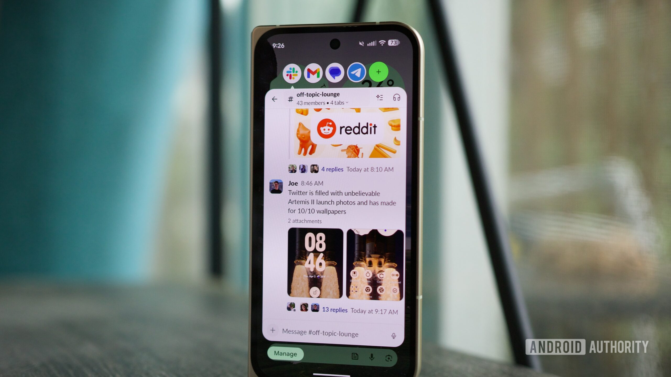
Perhaps the most notable addition to the platform is the introduction of "App Bubbles." While Google has flirted with floating window concepts in the past, the implementation in Beta 3 feels more cohesive and deliberate. By allowing users to long-press an application icon in the app drawer or home screen and select the bubble option, the operating system enables a persistent overlay that remains accessible regardless of the foreground task.
From an industry perspective, this feature signals Google’s ongoing commitment to bridging the gap between mobile and desktop-style multitasking. On a large-format device like the Pixel 10 Pro Fold, this is a transformative workflow improvement. By creating a hub for messaging services—Slack, Telegram, and Google Messages—within a single, collapsible bubble, users can maintain continuous communication streams without the constant need for context switching. While there are legitimate concerns regarding the current limitations in how these windows manage lifecycle events and memory, the utility for power users is undeniable. It effectively turns the Android home screen into a dynamic workspace rather than a static repository of icons.
Reclaiming Control: Granular Network Management
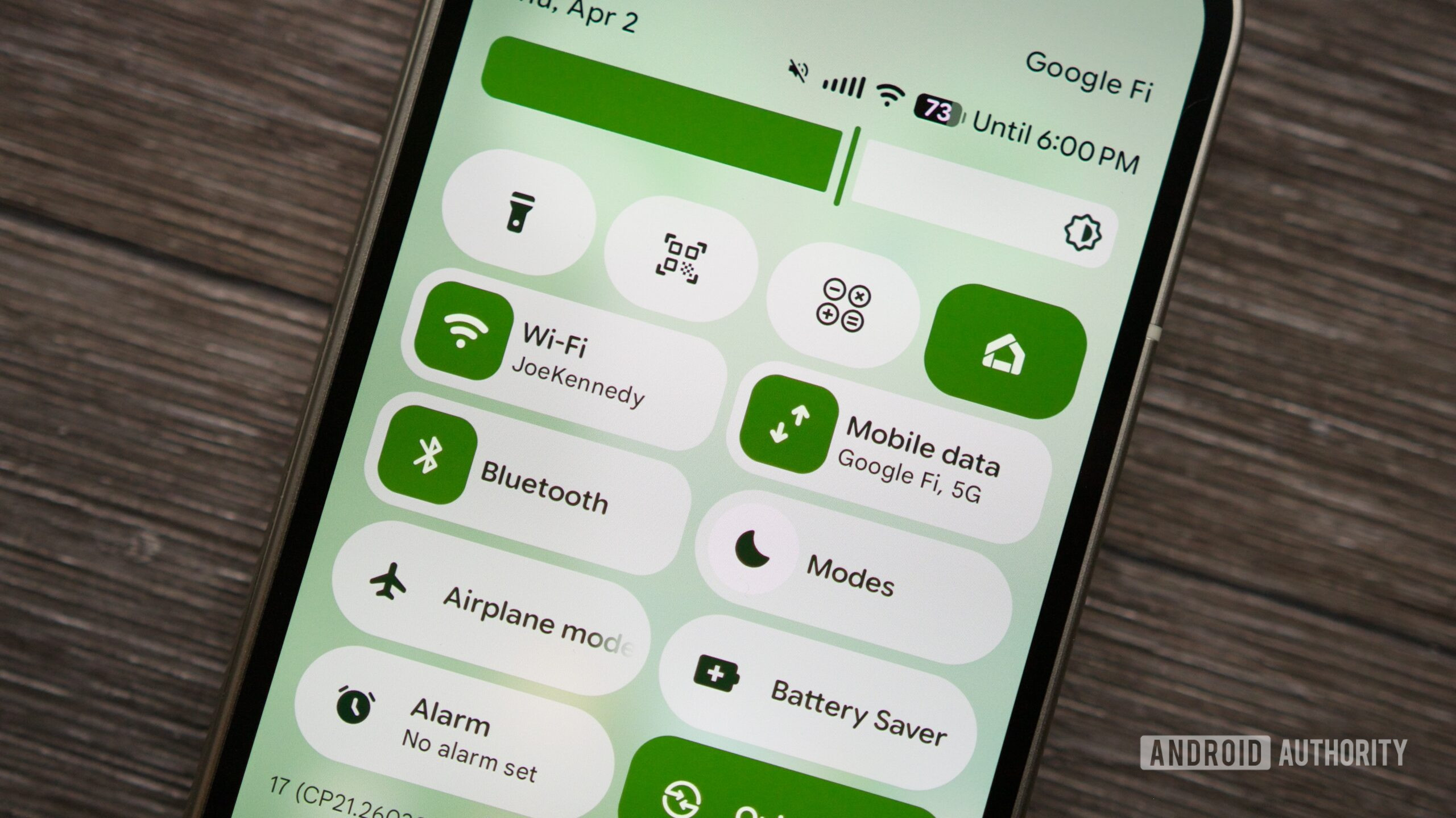
For years, the "Internet" tile in Android’s Quick Settings has been a polarizing design choice. Designed to simplify connectivity by bundling Wi-Fi and mobile data into a single, multi-tap menu, it inadvertently introduced latency into common tasks for many power users. Android 17 Beta 3 finally abandons this unified approach, opting for dedicated, single-tap toggles for Wi-Fi and cellular data.
This shift is more than just a preference for traditional UI layouts; it is a direct response to the way modern users navigate connectivity in a world of varying signal quality. When a device aggressively clings to a weak, non-functional Wi-Fi signal—a common scenario in transient environments—the ability to kill the Wi-Fi connection instantly to force a cellular handover is essential. By restoring direct control, Google is acknowledging that software "simplification" should never come at the expense of functional efficiency. This change alone will likely save users countless seconds of frustration daily, proving that sometimes, the most effective innovation is the restoration of user agency.
Precision Audio: The Assistant Volume Slider
One of the more subtle yet profound quality-of-life improvements in this release is the decoupling of the Virtual Assistant’s output volume from the general media volume. Previously, if a user wanted to lower the voice of Gemini, they were forced to lower the master media volume, which inevitably impacted music, video playback, and social media content. This created a cycle of constant volume adjustment that hampered the flow of interaction.
The new "Assistant volume" slider, buried within the Sound & Vibration settings, is a masterclass in nuanced UX design. By creating a separate audio channel for voice-based interactions, the operating system allows for a personalized listening experience. This is especially critical as AI assistants become more conversational and proactive. If an assistant is to be a constant companion, its presence must be adjustable to fit the user’s environment without requiring constant manual intervention. This update reflects a maturing understanding of the audio ecosystem in modern smartphones, where different types of digital content require distinct volume profiles.
Aesthetic Customization: Minimalist Home Screen Design
While functional updates often steal the spotlight, the aesthetic evolution of the Pixel Launcher is equally significant. With Beta 3, Google has introduced the ability to hide application names on the home screen. This feature, which has been a staple of third-party launchers for years, is a welcome addition to the stock experience.
Beyond the superficial appeal of a "cleaner" look, this customization option represents a shift in Google’s design philosophy. For a long time, the Material You design language was strictly enforced, leaving little room for individual preference. By offering more control over icon labels, Google is finally embracing a more flexible design ethos that caters to users who prioritize visual minimalism. It is a sign that the company is listening to the enthusiast community, acknowledging that customization is a key component of the Android identity.
Industry Implications and the Road to Stability
Android 17 Beta 3 is significant not just for these four features, but because it confirms the OS has reached "platform stability." This is a crucial milestone in the software development lifecycle, indicating that the APIs and app-facing behaviors are now finalized. For developers, this provides the necessary certainty to begin finalizing their own applications for the upcoming release.
Looking forward, the broader industry implications of these changes are clear: Google is focusing on "frictionless" computing. Whether it is through the ease of managing network states or the ability to tailor assistant volume, the goal is to make the hardware and software relationship feel more intuitive. The shift towards more robust multitasking and granular control is a necessary response to the growing complexity of mobile devices, especially as foldables and large-screen tablets become more prevalent.
Future Trends: What Lies Ahead
As we anticipate the formal reveal at the next Google I/O, it is evident that Android is moving into a phase of maturity. The era of massive, sweeping UI changes has given way to a period of refinement and performance optimization. The integration of AI, represented here by the Assistant volume controls, will undoubtedly continue to be a primary focus in future builds.
The transition from the experimental nature of Beta 1 and 2 to the refined, feature-rich nature of Beta 3 sets a high bar for the final public release. If these trends hold, the official rollout of Android 17 will be characterized by a focus on user-centric efficiency and design freedom. For the Android ecosystem, the future is looking less like a rigid operating system and more like a fluid, customizable environment that adapts to the specific needs of the user. As the June release window approaches, the excitement is building—not just for the new features themselves, but for the promise of a more responsive and intelligent mobile experience. We are witnessing the refinement of a platform that is finally beginning to strike the right balance between simplicity and power.
