

The modern smartphone landscape has long been dominated by tall, monolithic slab devices that prioritize vertical scrolling above all else. However, a dedicated lineage of mobile hardware enthusiasts has consistently championed alternative form factors—ranging from the legendary BlackBerry Passport and the pioneering Microsoft Surface Duo to the earlier iterations of horizontal-leaning foldables. With the arrival of the Samsung Galaxy Z Fold 8, the industry takes another decisive step away from cramped, narrow screens toward a more balanced, ergonomic, and landscape-friendly philosophy. Retailing at a luxury price point of $1,900, this flagship foldable commands high expectations, requiring users to look past traditional smartphone habits to unlock its true utility. Transitioning from a conventional slab phone or even an older, narrower book-style foldable means rethinking how you interact with mobile software. To bridge the gap between out-of-the-box potential and optimal daily productivity, several foundational configuration steps can dramatically elevate your user experience from day one.
Mastering Advanced Multitasking and Screen Real Estate Management
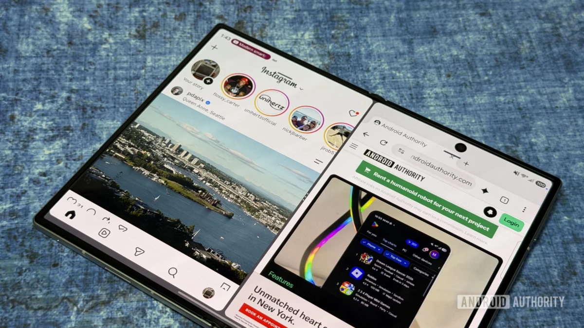
The hallmark of any high-end foldable device is its ability to handle complex computing tasks that would choke a standard smartphone. When utilizing the expansive 7.6-inch internal display of the Galaxy Z Fold 8, leveraging the robust split-screen and multi-window capabilities built into One UI 9 becomes essential. Unlike traditional handsets where side-by-side app execution feels cramped and largely theoretical, the wider aspect ratio of this new hardware makes dual-app workflows genuinely practical. Initiating a split-screen session is seamless: launching a primary application and tapping the top interface dash immediately prompts options for multi-window deployment, allowing you to seamlessly integrate a secondary application into your field of view.
Beyond basic split-screen views, power users can heavily benefit from asymmetric layouts, such as the 90:10 multitasking configuration. This setup dedicates the vast majority of the display to a primary workspace while keeping a secondary reference tool instantly accessible via a quick tap. For professionals frequently transferring data between communication channels and document editors—such as lifting text from an incoming email to populate a calendar entry or cloud document—this approach drastically reduces friction.
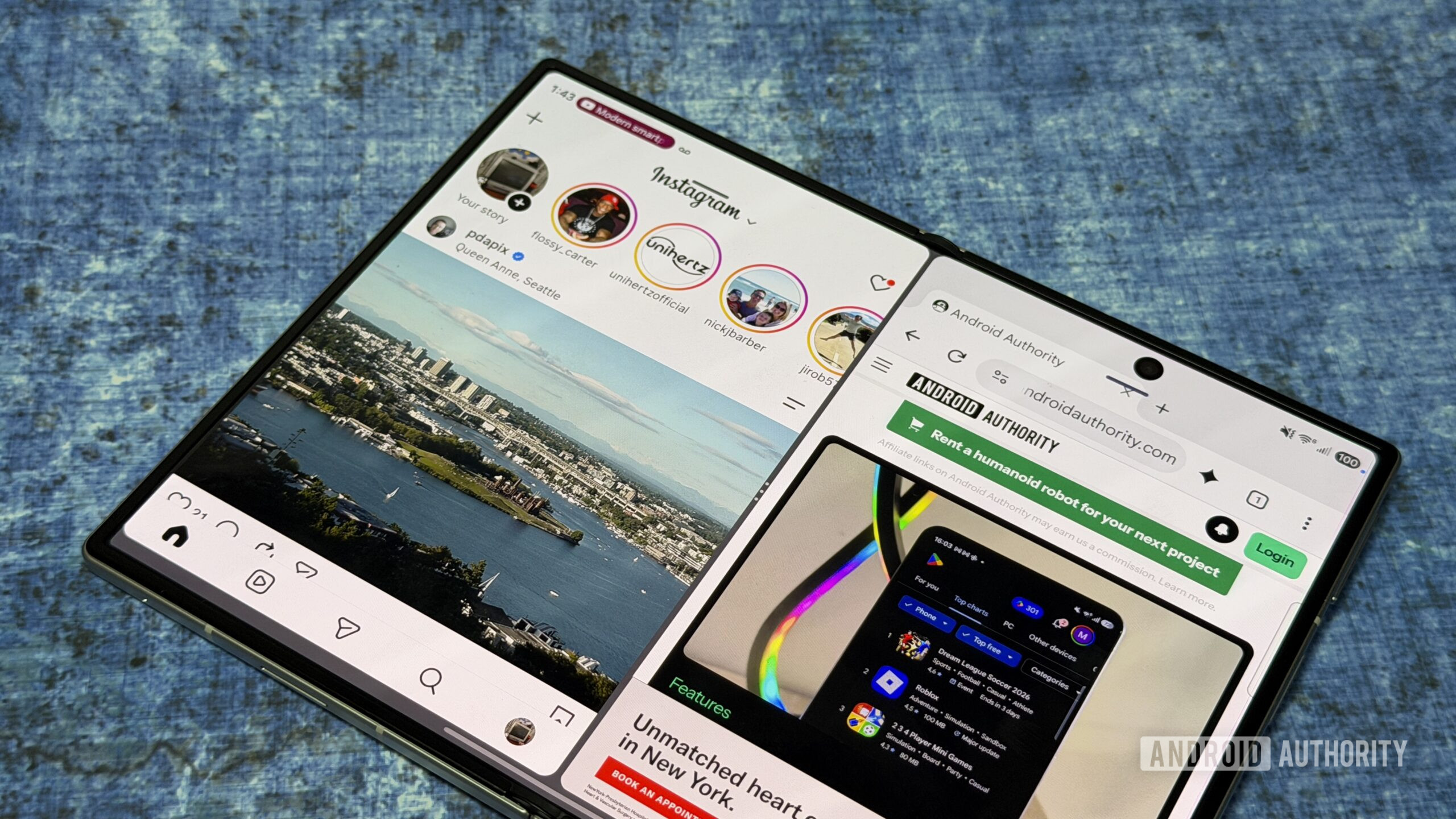
Furthermore, investing time upfront to configure and save "App Pairs" pays substantial dividends over time. By tapping the divider interface between two active windows, users can anchor their favorite combinations directly into the Edge Panel. Interestingly, the hardware architecture of the standard Galaxy Z Fold 8 even permits a three-app side-by-side layout, a feature traditionally reserved for larger tablet form factors or the multi-pane Galaxy Z TriFold. While dividing the primary canvas three ways can occasionally test the boundaries of a 7.6-inch panel, the option remains an invaluable tool for intensive research and data monitoring.
Embracing Dynamic Orientation Shifts
One of the most liberating aspects of moving to a wider book-style foldable is the freedom to break away from rigid landscape constraints. While many software developers optimize their platforms primarily for horizontal usage on foldables, the proportions of the Galaxy Z Fold 8 make fluid orientation switching remarkably intuitive. When engaging with social media platforms and content feeds—such as Instagram or Threads—the native landscape view provides ample space, but rotating the hardware into a vertical portrait orientation unlocks a completely different ergonomic feel.
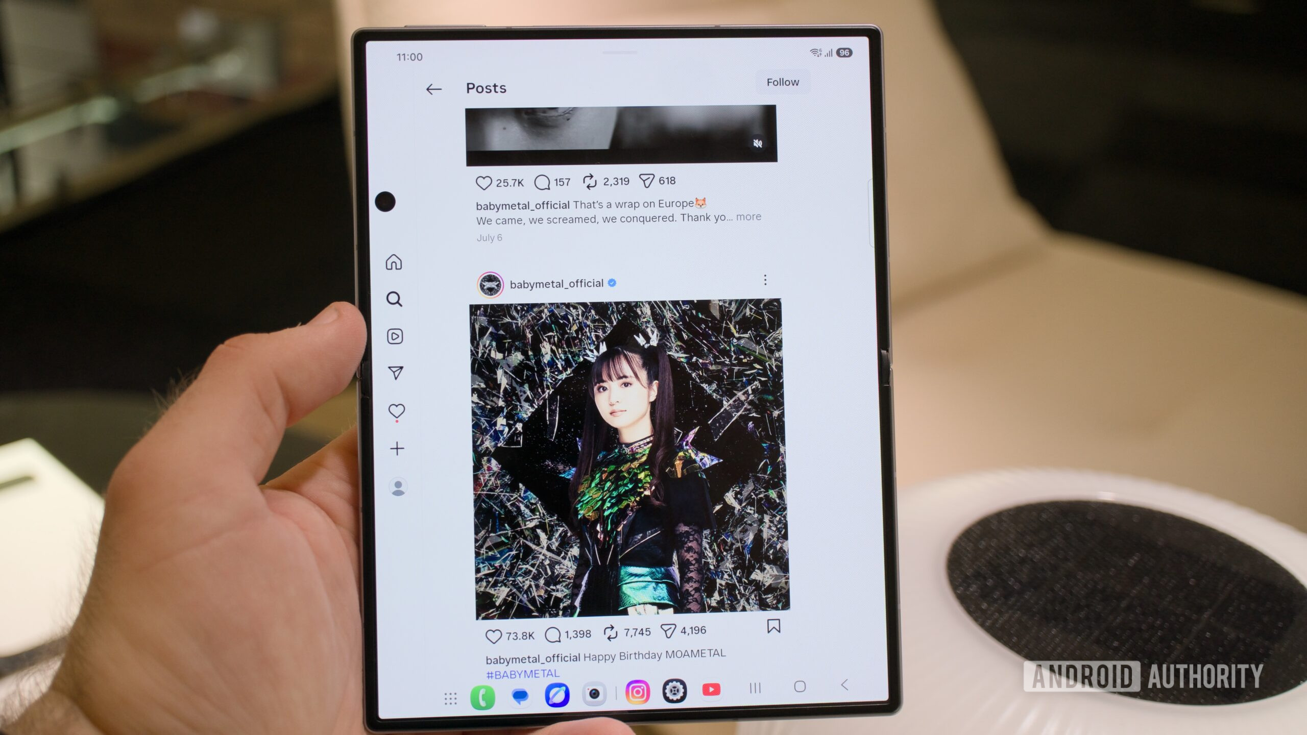
Unlike bulkier multi-screen devices that can feel unwieldy or unbalanced when turned vertically, this model strikes a precise dimensional balance, mimicking the tactile comfort of an 8-inch tablet when held in hand. This dual-nature versatility ensures that users no longer have to compromise between the pocket-friendly convenience of a cover display and the immersive nature of an open canvas. Adapting to this fluidity allows for a more natural consumption of varying media types throughout the day, ensuring that text-heavy documents and image-driven feeds each get the exact orientation they demand.
Navigating the Labs Menu for Unrestricted Software Scaling
While manufacturers strive to deliver polished out-of-the-box experiences, precautionary software limitations often restrict third-party applications from fully utilizing unconventional screen ratios. To extract maximum value from your investment, a thorough exploration of the device’s experimental settings is mandatory. Navigating to the system settings and locating the specialized Labs menu reveals critical toggles that transform how stubborn applications behave on a foldable screen.
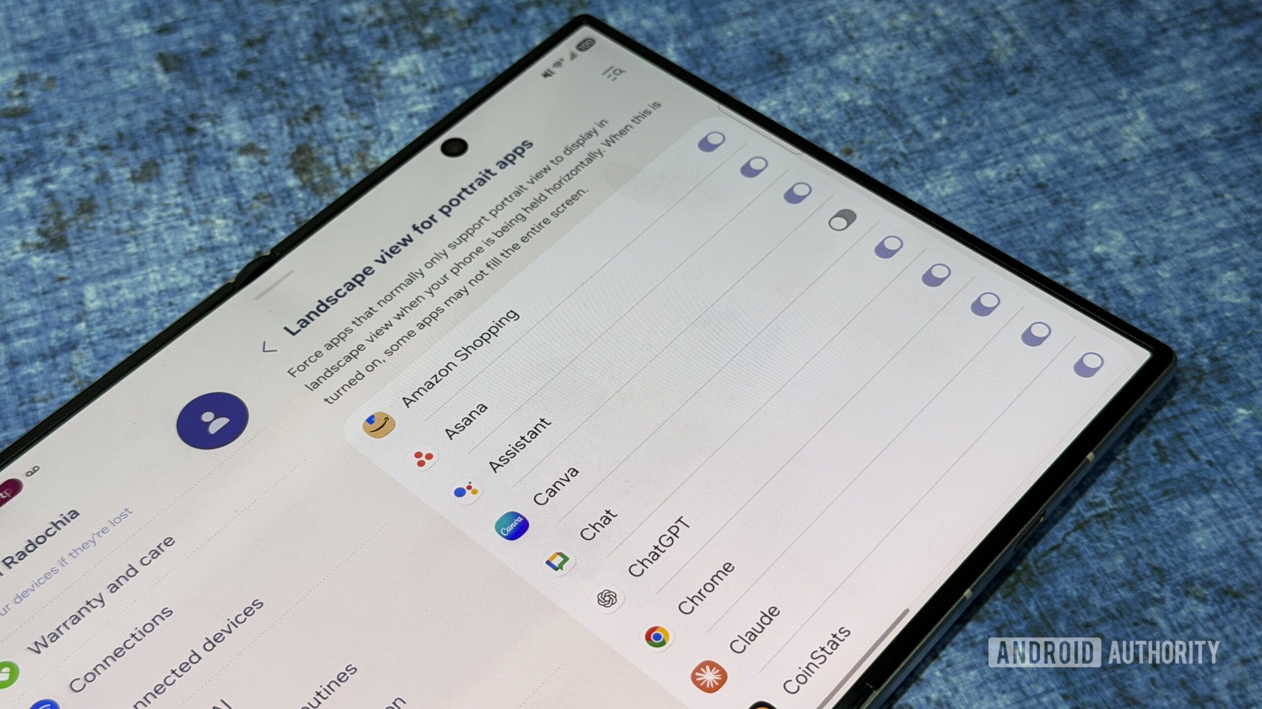
The primary setting to adjust is the multi-window enforcement toggle for all installed applications. Activating this feature forces non-optimized software to respect split-screen parameters, effectively breaking down arbitrary developer barriers. While minor graphical anomalies or unconventional aspect ratios may occasionally surface in fringe applications, the sweeping productivity gains overwhelmingly compensate for these minor visual quirks. Additionally, verifying that your most frequently used apps are granted permission to scale properly in horizontal orientations prevents jarring layout snaps, ensuring a seamless visual transition as you open and close the device.
Capitalizing on the Enhanced Tent Mode Experience
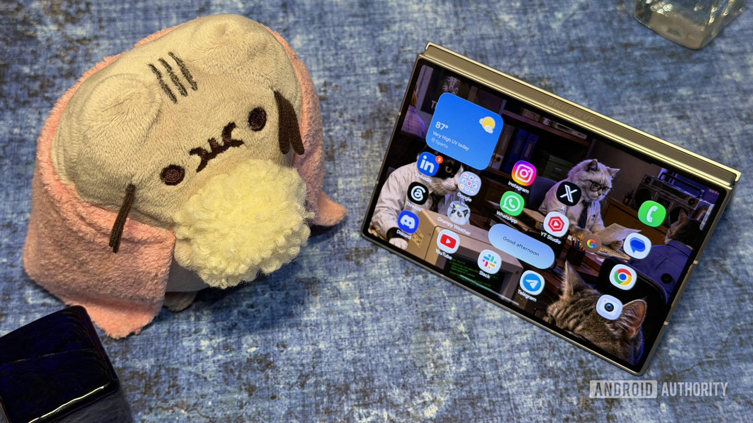
Discussions surrounding the hardware evolution of modern foldables frequently center on the presence or absence of specific positioning frameworks, yet the practical execution of alternative device postures deserves equal attention. While older or ultra-tier variants often struggled to deliver compelling media consumption experiences in non-standard configurations, the hardware proportions of the Galaxy Z Fold 8 breathe new life into tent mode.
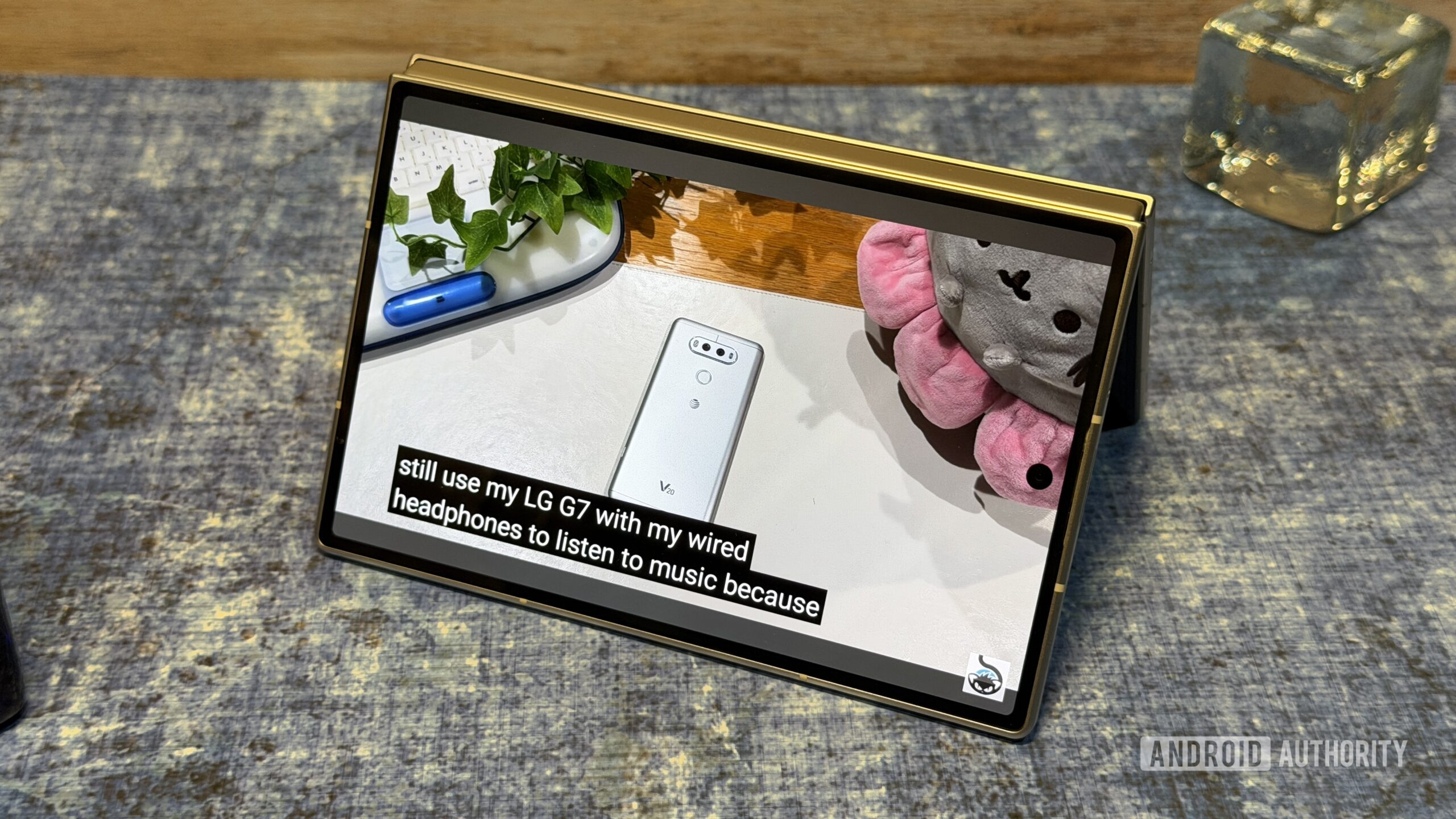
When folded into a tent posture, the device leverages its outer display—sporting a comfortable 16:10 aspect ratio—to present video content with striking fidelity and minimal letterboxing. This makes spontaneous media streaming on kitchen counters, airplane tray tables, or office desks vastly superior to previous generations. Rather than mourning the exclusion of legacy hinge postures, users are encouraged to lean into this refined viewing mode, which quickly establishes itself as an indispensable companion for casual entertainment and hands-free video conferencing.
Customizing Independent Display Layouts
A common historical grievance among foldable device owners involved aggressive screen mirroring, where actions performed on the cover screen automatically replicated onto the internal display, resulting in messy icon organization and disjointed workflows. Fortunately, the implementation of One UI 9 disables this behavior by default, treating the outer cover and internal canvas as entirely distinct computing environments.
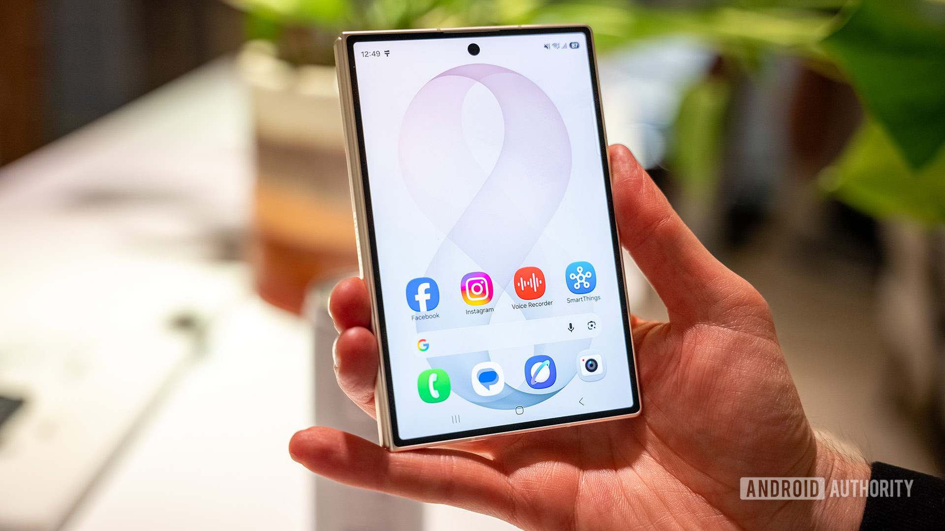
Treating the outer 16:10 cover screen like a compact, highly efficient smartphone—populated exclusively by quick-response communication tools, transit passes, and essential widgets—keeps the daily-driver experience streamlined. Conversely, the expansive internal display can be curated like a dedicated mobile workstation, featuring heavy productivity suites, multi-app pairs, and expansive web browsing spaces. By treating the hardware as two distinct devices fused into a single chassis, users can construct a deeply personalized ecosystem that adapts dynamically to their immediate operational needs. Ultimately, leaning into these nuanced configuration steps ensures that the device transcends its status as a mere novelty, cementing itself as a genuinely transformative tool in the modern mobile landscape.
