
The fundamental divergence between the Android and iOS operating systems has historically been reflected in their distinct design philosophies. Android, rooted in the principles of Material Design, champions adaptability, personalization, and a dynamic interaction layer, currently evolving through the "Material 3 Expressive" framework. Conversely, iOS has cultivated an aesthetic often characterized by its sleek, layered, and sometimes visually dense interfaces, exemplified recently by what is colloquially termed the "Liquid Glass" design language—a set of visual cues emphasizing translucency, soft shadows, and specific navigational patterns. The concern, which resonates deeply within the Android enthusiast community, is the increasing, and often jarring, adoption of these Apple-centric visual tropes within third-party applications running on Google’s ecosystem. This phenomenon threatens the hard-won visual cohesion that developers have strived to maintain for years.
For the dedicated Android user, the platform’s greatest strength lies in its unparalleled configurability. The ability to install custom launchers, modify icon packs, and fundamentally alter the operating system’s shell is a hallmark feature. In this context, the voluntary adoption of aesthetic themes, even those resembling iOS elements, via third-party launchers is generally acceptable, as it represents a deliberate user choice to deviate from the default experience. The critical friction point arises not from user-driven customization, but from application developers unilaterally imposing an iOS-derived visual schema as the default experience on Android devices. When a developer opts to deploy a UI that mirrors Apple’s proprietary design language, or worse, a poorly translated facsimile thereof, over leveraging Google’s native Material 3 framework, the resulting user experience feels inherently alienating and fundamentally inconsistent with the host operating system.
The Spectrum of Design Infringement
The severity of this design bleed is not uniform; it exists on a spectrum. At one end are applications that maintain a clear, platform-appropriate visual style, respecting the established design grammar of Android. At the other are those that seem to have undergone a near-direct porting of their iOS counterparts, sometimes resulting in a confusing hybrid interface.
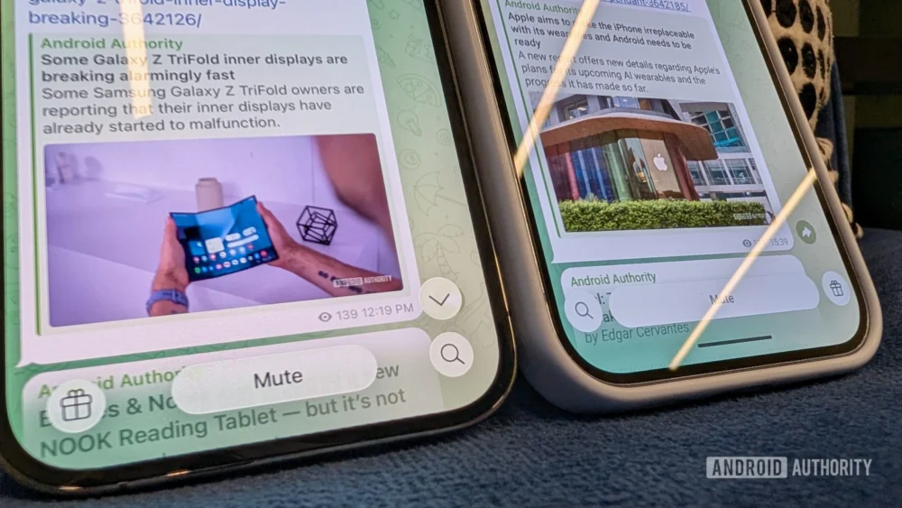
A recent, high-profile instance illustrating this tension is found within the widely utilized note-taking application, Obsidian. Following a significant update, the application’s user interface (UI) on Android devices exhibited an unmistakable iOS influence. Key elements include the deployment of distinct, circularly framed floating action buttons positioned rigidly at the top corners of the screen, a bottom-anchored floating navigation bar, and a distinct austerity in color palette—characteristics heavily associated with Apple’s current design lexicon. While the application’s performance—its responsiveness and perceived "snappiness"—is commendable, this functional smoothness is undermined by the aesthetic incongruity. For users invested in the tactile and visual feedback loops provided by Material Design, encountering such an aggressively cross-platform aesthetic feels like an unnecessary imposition.
From a constructive standpoint, even minor adjustments could significantly bridge this gap. For example, those prominent circular control buttons, instead of strictly adhering to the iOS circle, could be re-envisioned using Android’s established visual vocabulary. Drawing inspiration from native components, such as the shape handling seen in Google’s own Screenshot utility, these controls could adopt a slightly elongated, "squashed circle" profile, prioritizing width over perfect circularity. Furthermore, the heavy reliance on drop shadows, a common trait in Liquid Glass implementations, could be entirely abandoned in favor of the flatter, more dimensionally defined surfaces characteristic of Material Design, where depth is conveyed through elevation and subtle layering rather than overt shadowing.
The Promise of Material You vs. Aesthetic Compromise
Google’s design trajectory, particularly with Material 3 Expressive, has emphasized a departure from rigid uniformity toward an emotionally resonant, dynamic interface. This system excels in integrating user-selected color palettes—the core concept of Material You—seamlessly across the entire application interface. Imagine the Obsidian buttons, rather than being stark white or gray placeholders, dynamically adopting the user’s chosen accent colors, mirroring the thematic consistency found in robustly integrated apps like Gmail or Google Messages.
This integration is not merely cosmetic; it is foundational to the modern Android experience. Users who frequently cycle their device’s color scheme—perhaps seasonally, or to match specific moods or holidays—expect applications to reflect these changes. Material You, when executed correctly, uses these colors strategically as accents, highlighting primary interactions without overwhelming the content. The current trend of adopting Liquid Glass elements effectively bypasses this powerful personalization feature, leaving users with static, platform-agnostic UIs that feel perpetually out of sync with their personalized operating system environment.
Inconsistency as a Design Strategy: The Telegram Case Study
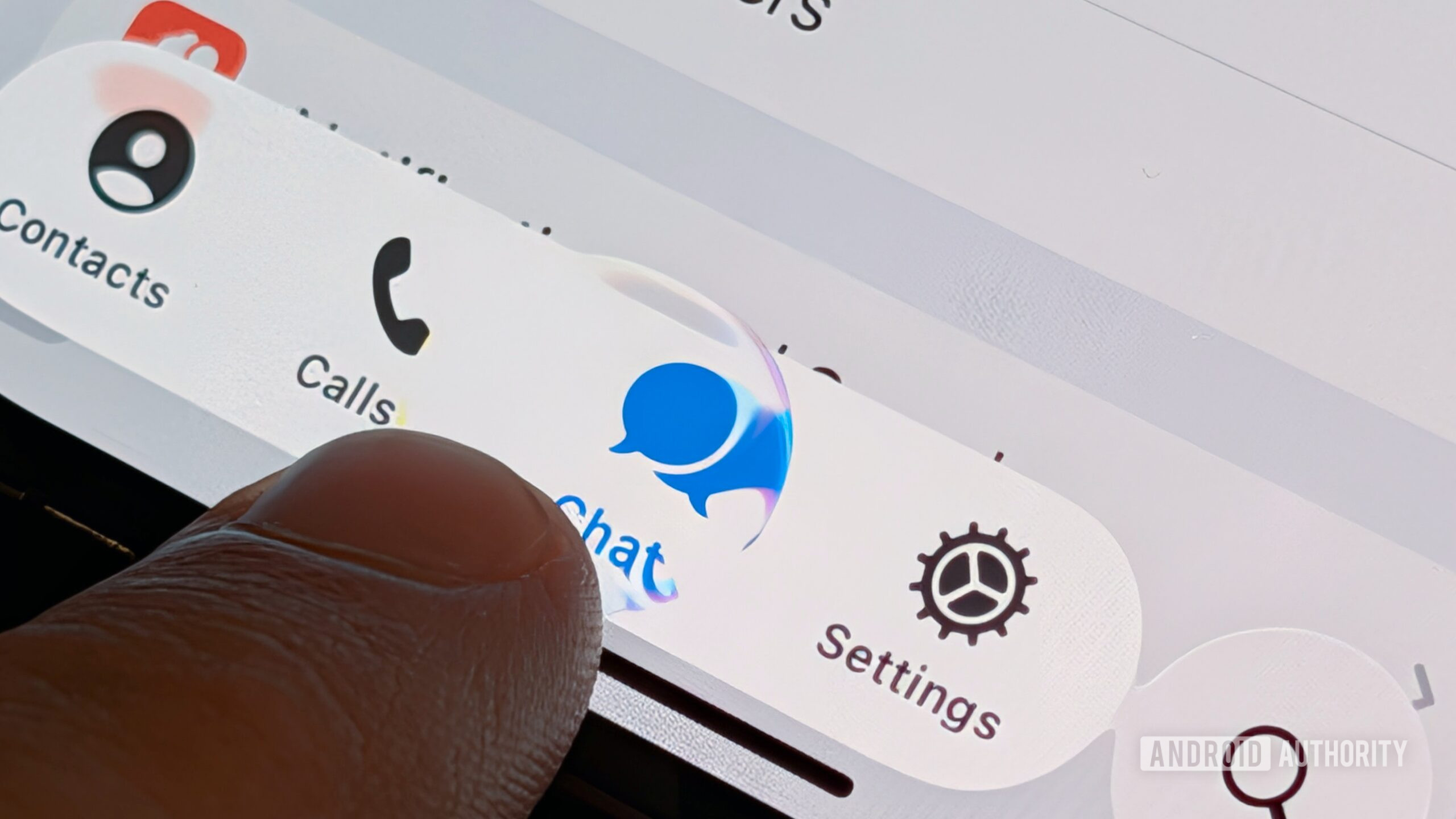
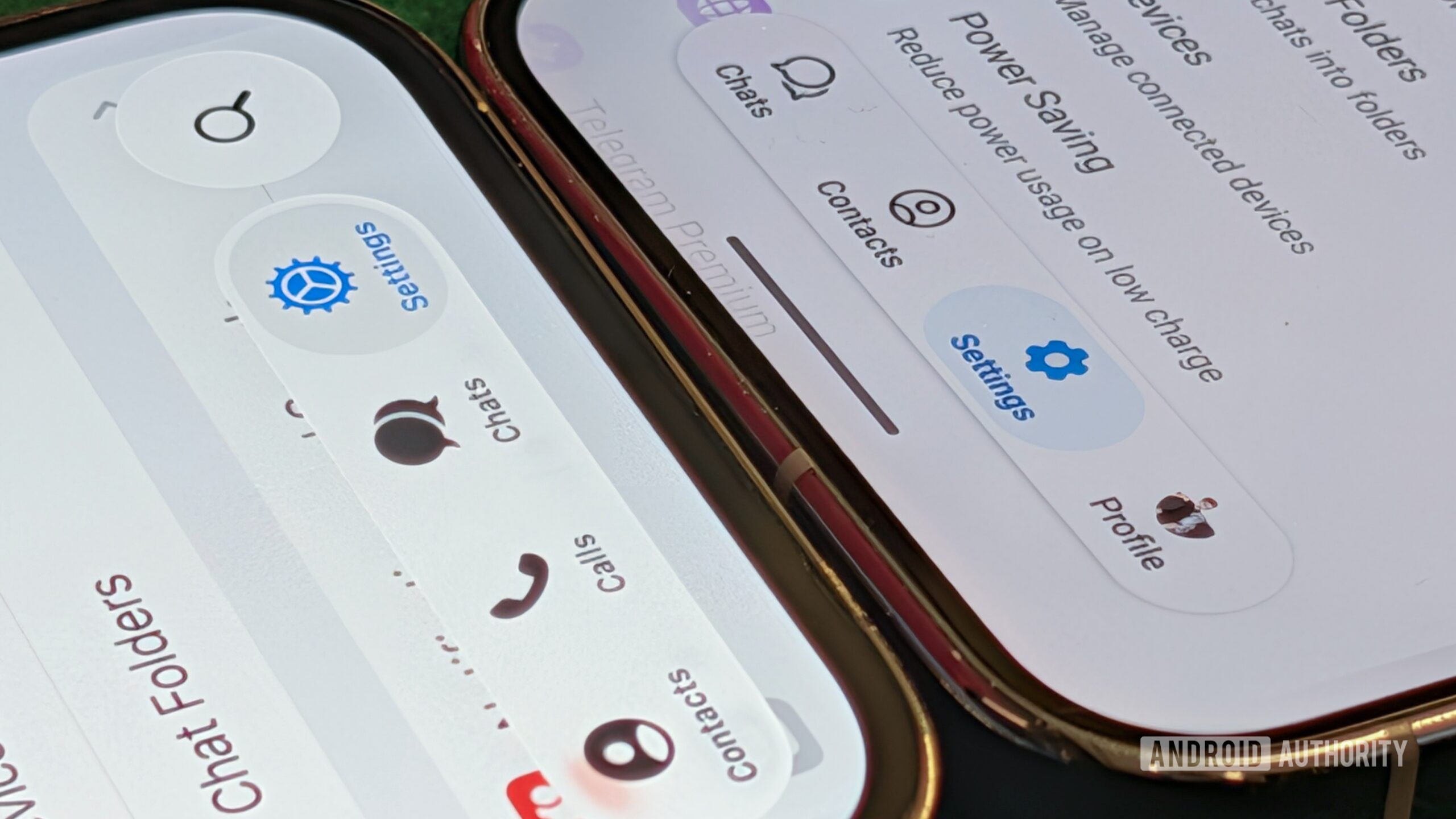
The migration toward iOS-like design is not limited to niche productivity tools; it permeates major, high-frequency communication platforms. Telegram offers a compelling example of this design fragmentation. Historically recognized for its fluid animations and sophisticated, self-contained design language, Telegram’s recent Android overhaul presents a confusing visual dichotomy.
Upon initial inspection, the updated Android interface appears to be a muted, simplified rendition of its iOS counterpart. However, deeper examination reveals a chaotic mixture of design elements. In personal chat threads, the header elements retain vestiges of Telegram’s older, established Android look. Simultaneously, the navigation bar within "Channels"—Telegram’s broadcast mechanism—seems to have adopted design cues directly traceable to the Liquid Glass aesthetic. This results in a UI that is not purely iOS, not purely Material, but a "hodgepodge" of disparate design systems struggling to coexist on the same screen. While the application remains functionally sound and retains its signature animation fluidity, the user experience is inherently fractured. It signals a lack of commitment to either mastering the native Android environment or fully embracing a singular, unified custom design language.
The Economics of Design: Custom vs. Native Tooling
Why does this phenomenon persist, particularly among large, well-resourced developers? The motivation often boils down to resource allocation and cross-platform development efficiency. Building and maintaining two completely separate, native UI toolkits for iOS and Android is resource-intensive. Consequently, many developers gravitate toward cross-platform frameworks or opt to develop a single, unified design system intended to span both mobile environments.
The Robinhood application serves as a positive counterpoint to this trend. Robinhood has clearly invested heavily in developing a distinct, proprietary design system that maintains visual fidelity across both Android and iOS. Critically, this system is self-contained; it does not borrow heavily from either platform’s native guidelines. Users interacting with Robinhood experience a consistent brand identity regardless of their device, which is a legitimate strategic choice for brand reinforcement.
The problem arises when developers attempt a shortcut: leveraging the robust, pre-built components of one platform (iOS) while only partially integrating the native tooling of the other (Android). When Telegram updates its iPhone application to fully embrace the latest Liquid Glass standards, it signifies a prioritization of that ecosystem’s visual evolution. The Android version, meanwhile, is left with a patchwork—a testament to efficiency gains at the expense of platform integrity. The resulting feeling for the Android user is one of being relegated to a secondary platform, using an interface that is fundamentally not designed for their device.
The Future Implications for Android Development
The pervasive adoption of foreign design elements carries significant industry implications. Firstly, it stifles the evolution and adoption of Google’s own design language. Material 3 Expressive, which promises a more visually rich and expressive future for Android, is nearing a year past its major showcase, yet visible, high-quality implementations from third parties remain scarce. If developers are hesitant to fully embrace Material You, or if they actively choose Apple’s aesthetic cues instead, the trajectory of Android UI development risks stagnation or fragmentation at the highest levels.
Secondly, it undermines the concept of a native user experience. A core tenet of successful software engineering is creating an application that feels "at home" on its operating system. When an Android user opens an application and is immediately confronted with visual signifiers—such as specific button treatments or navigation placements—that scream "iPhone," the cognitive load increases. The user must constantly recalibrate their expectations of interaction patterns.
For developers, the cost-benefit analysis needs re-evaluation. While immediate cross-platform code reuse saves development hours initially, the long-term cost includes user friction, brand inconsistency, and the alienation of a significant portion of the mobile user base that values native fidelity. As Android hardware continues to push boundaries in display technology, dynamic refresh rates, and advanced color rendering, the applications running on them must evolve in tandem using the tools provided by the platform owner. The potential of Material 3 Expressive—with its emphasis on dynamic color, delightful motion, and structural flexibility—is immense, and it deserves dedicated developer attention rather than being sidelined by borrowed visual shorthand from a competitor’s design system. The commitment to a singular platform identity, whether proprietary like Robinhood’s or native like Google’s Material framework, ultimately leads to a superior and more trustworthy digital experience.
