
The initial rollout of any major operating system update, particularly in the developer or public beta phase, often serves as a subtle barometer for the direction of the platform. Google’s recent deployment of Android 17 Beta 1, while generally characterized by its relative paucity of sweeping, visible feature additions, has quietly introduced foundational quality-of-life improvements that fundamentally alter the daily interaction experience for power users. Having spent a significant period navigating the updated environment, the transition back to the stability of the current production build, Android 16, reveals just how deeply ingrained two specific enhancements have become. These are not flashy AI overhauls or drastic visual redesigns; rather, they are surgical strikes against long-standing user interface rigidity, making the prior experience feel unnecessarily constrained.
The Context of Incremental Evolution in Mobile OS Development
To fully appreciate the significance of these minor yet impactful changes, one must consider the current landscape of mobile operating system development. In the years following the maturation of both iOS and Android, the major annual releases have increasingly focused on refinement, under-the-hood security enhancements, and deeper integration of AI capabilities, rather than wholesale paradigm shifts. The initial beta of a new version, like Android 17 Beta 1, frequently focuses on establishing the core architectural changes and accessibility standards that will underpin the subsequent feature drops. This cautious approach often leaves early adopters hungry for tangible interaction improvements.
Historically, Google has faced criticism for imposing fixed design elements, particularly on Pixel devices, which serve as the reference hardware for the Android ecosystem. Elements like the "At a Glance" widget and the static Google Search bar have long been points of contention—features deemed useful in isolation but problematic in their forced ubiquity on the primary home screen real estate. These elements, while providing immediate access to key information or search functionality, often clash with advanced users’ carefully curated home screen layouts, prioritizing Google’s informational density over user personalization.
The industry implication here is subtle but important: user expectations are shifting from mere feature parity to absolute control over the digital environment. As devices become extensions of personal and professional workflows, the tolerance for non-negotiable UI placement diminishes. Android 17 Beta 1 appears to acknowledge this trend, even in its earliest form, by addressing these two specific pain points.
Feature Deep Dive One: Reclaiming Home Screen Real Estate by Decoupling ‘At a Glance’
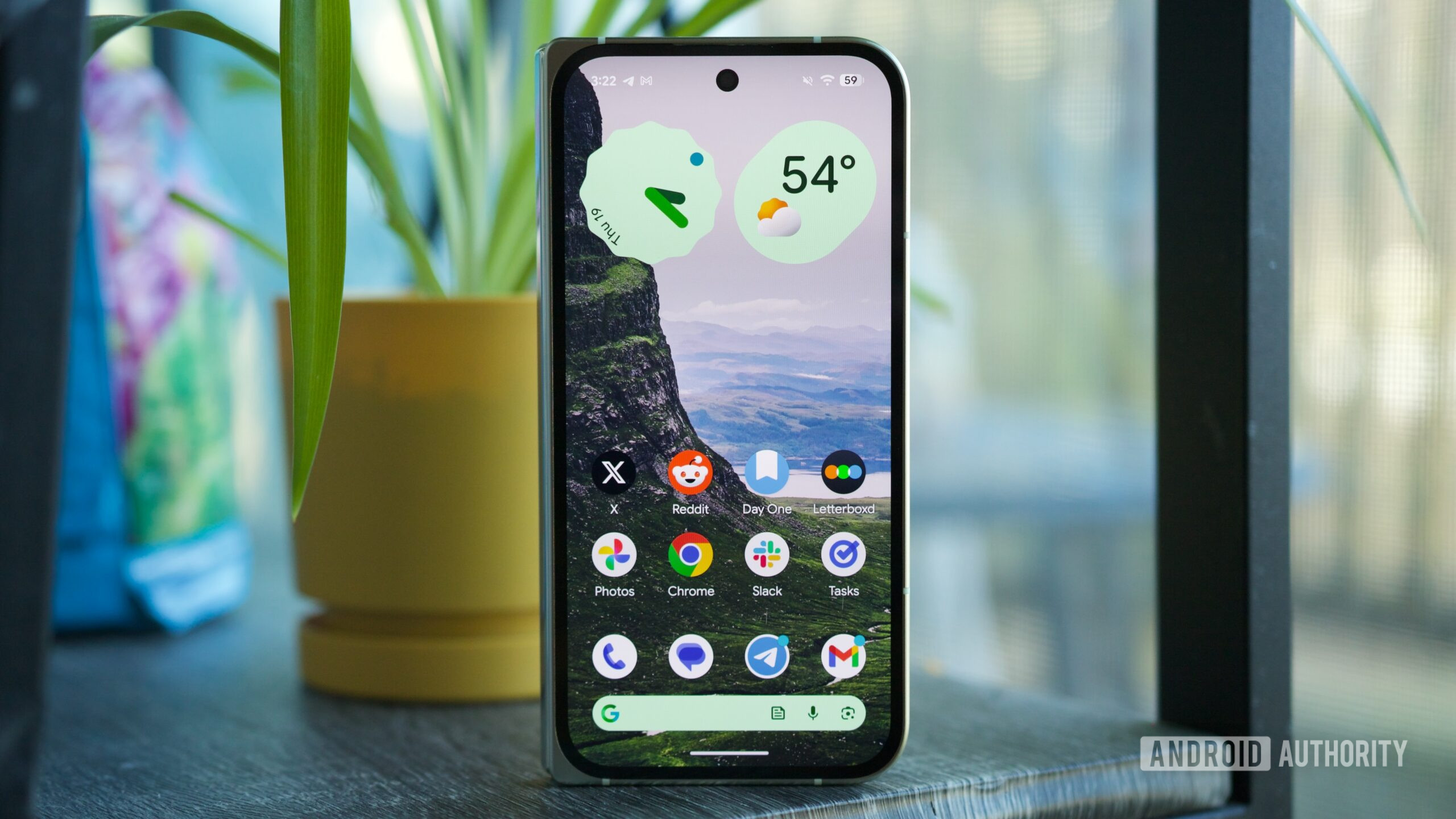
The "At a Glance" widget has been a defining, yet divisive, feature of the Pixel experience. Its strength lies in its contextual awareness: providing glanceable information such as weather forecasts, calendar alerts, package tracking updates, or active media playback controls directly on the lock screen or the home screen’s uppermost layer. For users prioritizing ambient information delivery, especially those utilizing the always-on display (AOD) functionality, this feature is invaluable, minimizing the need for full device unlocking for routine checks.
However, the imposition of "At a Glance" on the home screen—fixed above the app dock and occupying a dedicated vertical space—has been a persistent source of friction. This space is prime real estate for application icons, crucial folders, or dynamic, interactive widgets tailored to specific productivity needs. For users who prefer a clean, icon-dense home screen, the mandatory presence of "At a Glance" felt like a deliberate constraint on layout freedom. The inability to relocate, resize, or eliminate this module directly contradicted the open, customizable ethos Android traditionally champions.
Android 17 Beta 1 delivers a decisive solution: the introduction of a mechanism allowing users to entirely remove the "At a Glance" widget from the home screen while preserving its functionality on the lock screen and AOD. This distinction is critical. The core utility—the contextual information stream—remains intact where it is arguably most efficient (the lock screen), while the aesthetic and spatial burden on the primary workspace is lifted.
From an expert analysis perspective, this move signals a maturity in Google’s approach to its proprietary software features. It suggests a recognition that a "one-size-fits-all" approach to the home screen is no longer viable in a heterogeneous user base. While some observers might point out that this option saw limited, often unstable, availability in late-stage Android 16 maintenance releases (QPRs), its widespread and seemingly stable integration in the very first Android 17 beta confirms its status as a core, intentional platform enhancement for the new iteration. The immediate sense of relief upon freeing up that top row of vertical space is profound; it’s the difference between using a device tailored to your workflow and adapting your workflow to the device’s limitations.
Feature Deep Dive Two: Unlocking the Full Potential of the Google Search Bar
The second transformative addition centers on the embedded Google Search bar widget affixed to the bottom navigation area of the Pixel launcher. For years, this element offered a search function and, occasionally, rudimentary shortcuts (like opening the Google Discover feed), but it remained stubbornly resistant to the granular customization afforded to standalone widgets of the same type. Users could style the standard Google Search widget with custom colors, transparency levels, and assign specific actions to its internal buttons, yet the permanent home screen bar remained locked in its default aesthetic configuration.
Android 17 Beta 1 finally bridges this functional chasm. By introducing a dedicated "Widget settings" pathway accessible via a long-press on the persistent search bar, users now gain access to a robust suite of customization tools. This includes theme selection, precise transparency adjustments to better blend the bar with custom wallpapers, and, most significantly, the ability to redefine the behavior of the integrated shortcut button.
The immediate practical benefit of the shortcut customization is substantial. The ability to map this button to direct access to "News," "Saved Items," or even a direct voice search invocation streamlines frequent actions. For individuals deeply embedded in the Google ecosystem, toggling between a news feed aggregation or instantly accessing saved web articles without navigating menus or opening the main Google app represents a measurable efficiency gain over multiple interactions per day.
This change is more than just cosmetic alignment; it represents a significant step toward parity in customization fidelity across the launcher interface components. The technical implication is that Google is unifying the configuration APIs for its core launcher elements, suggesting a more cohesive design philosophy moving forward. In the context of the broader mobile industry, where manufacturers like Samsung and Xiaomi have long offered deep customization for their proprietary search/utility bars, Google’s adherence to a fixed design on its own hardware has often been viewed as an anachronism. Its resolution in Android 17 signifies a course correction driven by user feedback and competitive parity analysis.
Industry Implications and the Future Trajectory of Android Customization
The impact of these two features extends beyond the immediate Pixel user base. As the foundational codebase for Android, changes introduced and solidified in early betas often trickle down or influence the design language adopted by OEM skins (like Samsung’s One UI or Xiaomi’s HyperOS). The explicit allowance for the removal of a core Google UI element suggests a philosophical shift toward prioritizing user agency in interface design, a trend that competing mobile platforms will inevitably observe and potentially emulate.
Furthermore, the Search Bar customization touches upon the evolving relationship between operating systems and search engines. By allowing users to customize the entry point (the shortcut), Google is effectively enabling personalized entry funnels into its information services. Whether this leads to greater engagement with specific Google features (like Collections or Discover) or simply allows users to strip the bar down to its most minimal form, the power to choose the destination is now in the user’s hands.
The initial Beta 1 release, light as it is, sets a powerful precedent. It indicates that the development focus for Android 17 might be less about introducing entirely novel, complex systems and more about perfecting the established user experience—addressing the long-standing, nagging irritations that accumulate over several release cycles. This focus on "quality-of-life debt repayment" is often more appreciated by long-term users than abstract new functionalities.
Looking Ahead: The Promise Beyond Beta 1
While these two immediate accessibility improvements are compelling enough to make downgrading to Android 16 feel regressive, the broader roadmap for Android 17 suggests even more substantial evolution. The anticipated introduction of features such as the rumored "App Lock" functionality—offering native, system-level privacy controls for sensitive applications—and the potentially divisive redesign of the notification shade and Quick Settings panel indicate that major structural changes are still forthcoming.
The universal clipboard, a feature long standard in desktop environments, is another area where Android continues to refine its cross-device continuity narrative. These larger features will define the headline announcements of the final release. However, the success of a major OS release often hinges on how well it manages the daily friction points. The ability to instantly eliminate the redundant "At a Glance" widget and tailor the universal search mechanism demonstrates that Google is listening to the iterative feedback loop that drives dedicated early adopters.
In conclusion, the return to Android 16 after experiencing the minor but potent freedoms offered in Android 17 Beta 1 feels like voluntarily accepting visual clutter and functional rigidity. The ability to tailor the home screen layout by removing the mandatory "At a Glance" element and the empowerment to deeply customize the dedicated search bar are not just bug fixes; they represent a philosophical upgrade to user control within the Pixel environment, cementing Android 17’s early positioning as a significant, albeit subtle, step forward in mobile user experience design. The momentum generated by solving these enduring interface grievances suggests a more user-centric final release than the initial feature list might imply.
