
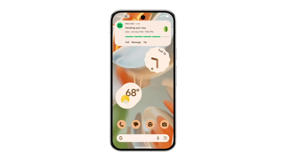
The foundational concept of Android’s Live Updates, introduced with the Android 16 operating system cycle, is undergoing a significant aesthetic refinement, as evidenced by recent observations within the latest Android Canary development builds. Live Updates, in Google’s initial framing, represented a specialized tier of notification designed to deliver crucial, ephemeral information via a continuous, horizontal progress indicator. This visual element occupies screen real estate adjacent to the front-facing camera array, bearing a functional resemblance to the ‘Live Activities’ system popularized on Apple’s iOS platform. Initially conceived as an ideal mechanism for tracking time-sensitive external processes—such as the status of a food delivery order or the minute-by-minute progression of a ride-hailing journey—the scope of Live Updates has already begun to broaden. Indications of its deployment in more complex applications, notably Google Maps, where it has been tested to visualize navigational segments delineated by varying traffic conditions, underscore its versatility as a system-level capability. The ongoing iteration, now visible in developer previews, suggests a maturation of this feature, moving it from a novel concept toward a more integrated and visually polished system component.
The observed modifications in the Canary builds signal a concerted effort to elevate the prominence and clarity of the progress bar itself, ensuring that the core function of the Live Update is immediately apparent to the user regardless of where the notification manifests—whether on the home screen, within the notification shade, or locked onto the device’s lock screen. While the underlying mechanics and the core data being conveyed appear stable, the visual scaffolding supporting this data is being overhauled. A key architectural shift involves the repositioning of the associated application’s icon. In the prior iteration, the icon occupied a left-aligned slot. The new design repositions this identifier to the upper section of the Live Update tile. This seemingly minor spatial adjustment yields a significant benefit: it liberates the horizontal plane, allowing the critical progress bar to span the full width of the dedicated Live Update container. This maximization of space directly translates to improved information density and superior visual hierarchy, ensuring that the status indicator dominates the user’s immediate attention.
Furthermore, the interactive elements within the Live Update module are receiving substantial visual upgrades. Previously, call-to-action buttons—the pathways for users to quickly return to the originating application—were represented simply by plain text labels. The updated interface introduces a more tactile and discernible button design. These textual labels are now enclosed within a clearly defined, pill-shaped border, lending them a more interactive, button-like appearance. While the current implementation shows these pill-shaped containers as un-filled or outlined rather than solid, suggesting an ongoing design refinement process, the intent is clear: to move away from purely textual affordances toward universally recognizable graphical user interface (GUI) elements that signal interactivity. This attention to graphical detail indicates that Google is treating Live Updates not as a temporary notification overlay, but as a permanent, high-visibility fixture within the Android operating environment.
Despite these notable structural and interactive enhancements, several core aesthetic parameters seem to have been intentionally retained. The color palette utilized for the notification elements and the physical thickness or weight of the progress bar itself appear to remain consistent with earlier builds. This suggests a cautious approach to iteration; Google seems focused on optimizing the layout and interaction design before potentially experimenting with deeper stylistic modifications that could impact visual consistency across the broader Android ecosystem. The transition of this refined design into more stable channels—specifically the upcoming Android 17 beta release—remains an open question. Development observed in Canary builds provides a roadmap, but features can undergo substantial alteration or even complete removal before achieving a stable public release. The current trajectory, however, suggests a strong commitment to evolving the Live Updates framework.
The Strategic Importance of Real-Time Information Delivery
To fully appreciate the significance of these UI refinements, one must consider the broader context of mobile operating system evolution. In the modern digital landscape, user expectations are calibrated toward immediacy. Delays, even momentary ones, in accessing status information—be it package tracking, navigation ETA, or the progress of a background download—are perceived as friction. Live Updates directly addresses this expectation gap. By pulling critical status information out of the traditional notification drawer and placing it into a persistent, high-fidelity element visible across various system states, Android is formalizing a system for ambient computing interaction.
This move is strategically vital for platform differentiation. The conceptual parallel to iOS Live Activities is undeniable, highlighting a convergence on essential UI paradigms for dynamic information presentation. However, Android’s implementation, particularly its integration points across the lock screen and home screen using the front camera bezel area, offers a unique hardware-aware approach. The aesthetic refinement is crucial because a feature designed for persistence must also be visually pleasing and unobtrusive. A clunky or poorly designed persistent element risks user rejection or, worse, leads users to disable system-level dynamic notifications altogether. By focusing on maximizing the progress bar’s footprint and clarifying button affordances, Google is investing in the feature’s long-term adoption.
Industry Implications: Shifting the Notification Paradigm
The evolution of Live Updates has profound implications for application developers and the digital service economy. For businesses relying on consumer trust and repeat engagement—logistics, transit, on-demand services—Live Updates transforms the user relationship from transactional to continuously informative.
For Developers: This polished interface provides a superior canvas for branding and real-time feedback. Developers are no longer relegated to static text alerts that require the user to unlock and navigate to the application. Instead, they gain a highly visible, system-vetted component for showcasing progress. The improved visual hierarchy (icon at the top, full-width bar) ensures that branding elements are clear, while the primary data remains the focal point. This heightened visibility incentivizes the creation of richer, more informative Live Update payloads, pushing development teams beyond simple "in progress" messages toward nuanced status reporting (e.g., "Driver is 2 minutes away," or "Route segment 3 experiencing 15-minute delay").
For Service Providers: The enhancement of the interactive button is particularly noteworthy. A clear, unmistakable button to jump directly into the application reduces cognitive load for the user seeking more detail. This frictionless transition path can directly impact customer satisfaction metrics. If a user can immediately access the full application interface with a single, clear tap from the persistent status bar, the perception of service reliability improves significantly. The industry trend favors "glanceable" information, and this visual polish on Live Updates makes Android a more compelling platform for services where timing is everything.
Expert Analysis: The Role of Visual Hierarchy in Ambient Computing
From a user experience (UX) perspective, the reported changes reflect sophisticated design choices centered around visual hierarchy and Fitts’s Law (the time required to rapidly move to a target area is a function of the distance to and size of the target).
- Maximizing the Indicator: By allocating the entire horizontal space to the progress bar, Google adheres to Gestalt principles, creating a singular, unified visual element that strongly communicates duration and completion. This is more effective than segmented or constrained indicators.
- De-emphasizing the Icon: Moving the application icon to the top serves to brand the update without competing with the primary functional element (the bar). The icon becomes context rather than the main subject of interaction.
- Affordance Clarity: The transition to pill-shaped, outlined buttons significantly increases their affordance—the perceived and actual properties that determine how the user can interact with the object. An outlined shape is a near-universal indicator for a clickable action in contemporary mobile design, reducing ambiguity that plain text might introduce, especially when the user is multitasking or distracted.
These refinements suggest Google is actively refining the visual language of its "ambient" features, ensuring that dynamic information layers integrate seamlessly without overwhelming the primary interface. The success of features like this hinges on achieving the perfect balance between being visible enough to be useful and subtle enough not to be intrusive.
Future Trajectory and System Integration Trends
The current polish applied to Live Updates foreshadows broader trends in Android’s future development, particularly leading into subsequent major releases like Android 17 and beyond.
Deeper System Integration: As Live Updates mature aesthetically, the next logical step involves deeper integration with the system’s core functionalities. We might anticipate Live Updates becoming more dynamic in response to device state. For example, an update for a running navigation app might dynamically alter its appearance or behavior based on whether the phone is in a pocket (requiring higher contrast) or mounted in a car cradle (allowing for larger interaction zones).
Expanded Use Cases Beyond Transactions: While ride-sharing and food delivery are excellent starting points, the utility of persistent, real-time feedback extends far beyond consumer services. Future iterations could see Live Updates supporting:
- Productivity: Tracking complex cloud syncs, large file transfers, or multi-step automation routines initiated by the user.
- Health and Fitness: Providing continuous feedback on timed workouts, hydration goals, or medication schedules without requiring the user to open a dashboard.
- System Maintenance: Offering clear progress indicators for major OS updates, application package installations, or critical security scans that previously relied on less visible progress circles.
API Evolution: For these refined visuals to become ubiquitous, Google must ensure the corresponding developer APIs are robust and easy to implement. The next stage will likely involve offering more customizable styling hooks to developers, allowing them to align the Live Update presentation more closely with their application’s proprietary design language while still adhering to the mandated structural constraints (like the full-width bar). If the barrier to entry for creating a visually appealing Live Update is low, adoption will accelerate rapidly.
In conclusion, the visual adjustments observed in the Android Canary builds are more than cosmetic tweaks; they represent a strategic refinement of a core future interaction model. By prioritizing clarity, maximizing the utility of screen real estate for the progress indicator, and adopting modern GUI conventions for interactivity, Google is ensuring that its real-time notification system is positioned to become a staple of the modern Android experience, capable of handling increasingly complex and context-aware information delivery. The industry watches closely to see how quickly this polished look transitions from the bleeding edge of Canary development into the stable releases that power the global Android user base.
