
The ecosystem of wearable technology, particularly smartwatches running Google’s Wear OS platform, is reaching a critical inflection point. As devices become more sophisticated, the demands placed upon companion applications shift from mere functionality to sophisticated, context-aware interaction. In this evolving landscape, Spotify, the dominant force in music streaming, appears to be iterating on its smartwatch presence, testing a significant visual overhaul for its "Now Playing" interface on Wear OS devices. This development suggests a strategic pivot toward prioritizing aesthetic immersion and gesture-based control over traditional, button-heavy interfaces typically constrained by small circular or square displays.
This nascent feature, observed during limited, server-side rollouts, transforms the fundamental interaction model for controlling playback on the wrist. Where previous iterations emphasized visible controls—play/pause buttons, skip arrows—the new design leans heavily into album art and track metadata, relegating core controls to more intuitive, albeit less explicit, gestures. This move is not merely cosmetic; it signals a deeper understanding of the context in which users interact with their wearables: often briefly, sometimes while engaged in other activities, and always with limited screen real estate.
Background Context: The Wearable Interface Challenge
For years, the primary challenge facing developers of apps for platforms like Wear OS (and its predecessor, Android Wear) has been input fidelity versus information density. Smartwatches are inherently constrained by size, battery life, and the difficulty of precise touch interaction compared to smartphones. Music control applications, in particular, require rapid access to essential functions—start, stop, skip. Older smartwatch interfaces often mirrored smartphone controls, resulting in cluttered, difficult-to-press targets that required users to slow down their activity significantly.
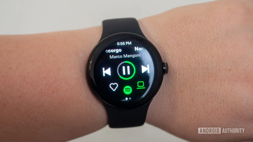
Spotify’s prior Wear OS implementations have generally followed this established pattern, offering standard playback controls visible on screen. While functional, this approach often feels iterative rather than innovative when applied to a device designed for quick glances. The recent testing, observed on a device running the latest iterations of Wear OS (potentially One UI Watch derivatives like the one noted on a Galaxy Watch 7), indicates a willingness by Spotify to break from this conventional mold.
The reported new "Now Playing" screen is characterized by its prominent display of album artwork and track details. This visual focus suggests an attempt to leverage the circular screens common in premium smartwatches—like the Google Pixel Watch line or Samsung’s Galaxy Watch series—as miniature digital canvases. By emphasizing the visual component, Spotify taps into the emotional resonance of album art, an aspect often lost when reduced to small, utilitarian icons.
Crucially, the control scheme appears to be shifting towards multi-touch gestures. A simple tap now reportedly handles the fundamental action of pausing or resuming playback, a highly efficient single-point interaction. More complex navigation, such as skipping tracks forward or backward, is handled via distinct double-tap gestures on the right or left periphery of the screen, respectively. This structure suggests a trade-off: reduced visual clutter in exchange for a slightly higher cognitive load to learn the gesture map. For users acclimated to basic smartphone interactions, double-tapping is intuitive, but integrating it into a rapid-fire sequence of actions requires practice.
Industry Implications: The Rise of Ambient Interaction
This testing by Spotify carries significant implications for the broader wearable technology industry. It suggests a maturation in how developers approach watch-based interaction design. The industry is moving away from trying to shrink the smartphone experience onto the wrist and toward creating truly "ambient" or context-aware interfaces.
Ambient computing emphasizes that the interface should recede into the background, providing necessary information or control with minimal user intervention. By minimizing the on-screen controls and relying on inherent device geometry (the edges of the screen) for navigation, Spotify is embracing a more ambient philosophy. If this design proves successful and gains widespread adoption, it sets a precedent for other media and utility apps targeting smartwatches. Imagine navigation apps prioritizing the map over turn-by-turn text, or messaging apps presenting summaries before requiring a full scroll through the thread.
Furthermore, this move aligns perfectly with the hardware capabilities of modern smartwatches. Modern chips offer robust processing for gesture recognition, and high-resolution OLED screens are perfectly suited for displaying rich graphics like high-resolution album art. Spotify is capitalizing on these hardware advancements rather than being constrained by legacy UI assumptions.
For Google and its Wear OS partners, this proactive development from a major third-party developer is a strong validation of their platform strategy. When foundational apps like Spotify innovate in platform-specific ways, it encourages users to invest further in the ecosystem, knowing that high-quality, bespoke software experiences await them.
Expert-Level Analysis: UX Trade-offs and Accessibility
From a User Experience (UX) analysis perspective, the proposed Spotify interface presents a fascinating balance of efficiency and potential friction points.
The efficiency gains from the single-tap play/pause are undeniable. In dynamic situations—running, cycling, or cooking—a single, broad tap on the screen is far easier to execute accurately than aiming for a small, dedicated pause icon. This directly improves the "Time to Action" metric for the most frequent command.
However, the reliance on double-taps for track skipping introduces a layer of ambiguity. Is a quick succession of taps interpreted as a single double-tap, or as two separate single taps (which would trigger play/pause twice, likely resulting in rapid on/off states)? Precision in gesture recognition becomes paramount. If the gesture detection algorithm is too sensitive, accidental skips will frustrate users; if it is too lenient, users will struggle to activate the feature reliably. This is where the quality of the underlying Wear OS touch input layer and Spotify’s specific implementation will determine long-term usability.
Moreover, the concept of "discoverability" is impacted. In the previous design, controls were explicit and discoverable simply by looking at the screen. In the new design, the controls are hidden until the gesture is performed. The report notes that the traditional, control-heavy screen is still accessible by swiping up from the visual-first screen. This layered approach is intelligent: it defaults to the aesthetically pleasing, minimalist view, but retains the comprehensive control panel as a fallback or for deeper interaction needs (like scrubbing volume or accessing playlists). This acts as an on-demand control surface, satisfying both the desire for minimalism and the need for granular control.
Accessibility is another dimension to consider. For users with limited dexterity or those wearing gloves, precise double-tapping might prove more challenging than tapping a larger, dedicated icon. This necessitates that Spotify maintains a robust fallback—the traditional view or potentially voice commands—to ensure the app remains usable across diverse user populations. The existence of the secondary, control-rich screen mitigates this risk significantly, positioning the new look as an enhanced default rather than an exclusionary replacement.
Future Impact and Trends: Deeper OS Integration
The trajectory suggested by this UI test points toward an even deeper integration between streaming services and the operating system itself. Currently, the control gestures appear to be managed within the Spotify app layer. The logical next step, however, involves leveraging native OS controls.
We might anticipate future iterations where the system-level media controls on Wear OS are updated to recognize these gestures globally. For instance, if a user receives a notification while music is playing, they might be able to dismiss the notification with a specific wrist flick (a hardware gesture) while simultaneously skipping a track using a double-tap on the watch face, all managed seamlessly by the OS framework responding to Spotify’s desired action mapping.
This trend underscores the growing importance of the "companion device" model. As smartwatches become independent entities capable of cellular connectivity and offline playback, the phone becomes less of a constant tether and more of a provisioning and configuration hub. Spotify is ensuring that its primary content delivery mechanism on the wrist is optimized for this increasingly standalone reality. If a user downloads a playlist for a run, they should not need their phone present, and the watch interface must function flawlessly on its own merits. The new, gesture-driven visual experience supports this move toward mobile independence for media consumption.
Furthermore, this visual refresh could foreshadow Spotify’s broader strategy for other constrained devices, such as in-car infotainment systems or future augmented reality (AR) glasses. If the core principle is "maximize visual information, minimize explicit button footprint," then the underlying design language is highly transferable. The success or failure of this Wear OS test will likely inform the design guidelines for Spotify’s presence across the entire spectrum of ambient computing hardware over the next few years. The focus on cover art suggests a desire to reinforce brand identity and visual continuity across all touchpoints, cementing the song or album as the central piece of the user experience, regardless of the device rendering it. This iterative, platform-specific enhancement demonstrates Spotify’s commitment not just to market share, but to perfecting the micro-interactions that define daily digital habits.
