
The ongoing evolution of digital wallet applications represents a fascinating microcosm of broader trends in user interface design and digital identity management. As platforms like Google Wallet mature from simple payment facilitators to comprehensive digital hubs for tickets, loyalty cards, and transit passes, the challenge of information architecture becomes increasingly acute. A recent deep dive into the latest iteration of Google Wallet (version 26.5.862583415) reveals a strategic shift in the application’s primary user flow, one that emphasizes immediacy for favored items while potentially introducing friction for less frequently accessed—yet still necessary—credentials. This change, driven by APK teardown analysis, signals Google’s commitment to curating a streamlined home screen experience, but it demands a closer examination of the trade-offs involved in accessibility.
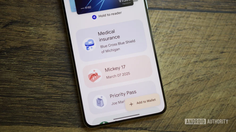
For years, the standard layout for digital wallets mimicked the physical act of pulling out a physical wallet: a linear, often endless scroll of stored items. While functional, this design quickly becomes unwieldy as users accumulate dozens of loyalty cards, event tickets, and transit passes. The industry consensus has been moving toward intelligence and prioritization. Apple Wallet famously uses contextual awareness (location, time) to surface relevant passes automatically. Google Wallet’s emerging strategy appears to favor user-defined control over this prioritization, introducing a "starring" mechanism to designate frequently used items that will populate the primary, immediately visible home screen carousel.
This prioritization mechanism, while theoretically elegant, is where the complexity surfaces. Previously, accessing the totality of one’s digital assets was a single action: opening the app and scrolling. The new design introduces a multi-step navigation hierarchy for anything not explicitly starred. The initial home screen will feature the starred passes prominently, accompanied by a "View more" button. This button, previously inert in earlier testing phases, now functions as a gateway to a secondary management screen.
Upon tapping "View more," the user is not immediately presented with their full inventory. Instead, they are directed to an intermediary hub. This screen serves several managerial functions: it provides access to payment method settings, facilitates the management of which passes are pinned to the home screen, and crucially, houses a secondary navigational element—the "View more passes" button. This structure inherently creates a two-tap journey to reach the comprehensive list of all stored credentials.
From a user experience (UX) perspective, this architectural decision warrants critical analysis. The immediate benefit is a decluttered, high-signal interface for the 90% use case: paying for coffee, boarding a flight, or using a frequently visited gym pass. However, the cost is the latency introduced for the 10% use case: retrieving an obscure, year-old concert ticket or a temporary parking validation code. In high-pressure environments, such as airport security lines or busy transit turnstiles, an extra tap or two can translate into noticeable user frustration and operational delays.
The intermediary screen, however, is not merely a hurdle; it offers powerful organizational tools that address the inherent chaos of accumulating digital assets. Within this management area, users gain the ability to sort their entire collection alphabetically or chronologically by "recently opened." This provides a strong recovery mechanism. If a user cannot recall if a pass was starred, they can navigate to this hub and use these sorting tools to locate the item efficiently. Furthermore, the inclusion of an "Archived" section at the bottom of the list is a sensible approach to data hygiene, allowing users to tuck away expired or obsolete passes without deleting the underlying data structure.
The "Manage passes on home" function found within this hub is equally significant. It allows users granular control over the starring mechanism, enabling them to reorder the primary carousel and explicitly select which passes deserve prime screen real estate. This level of customization moves Google Wallet away from being a purely reactive application (showing what it thinks you need) toward a proactive, personalized tool reflecting the user’s immediate lifestyle priorities.
Industry Implications: The Battle for the Front Screen
This design shift reflects a broader industry pivot toward application minimalism and focus. In the highly competitive digital wallet space, dominated by the mobile operating system providers (Google and Apple), real estate on the lock screen or the primary app interface is the ultimate currency.
For years, NFC payments (tapping to pay) were the core utility. With that functionality largely commoditized and instantaneous, the value proposition has shifted to secondary functions: ticketing, access control, and identity verification. When a wallet contains hundreds of data points, an interface that demands significant cognitive load to navigate will inevitably lead to abandonment or reduced engagement with ancillary features.
Google’s move appears to be an acknowledgment that "more is less" when it comes to immediate utility. By enforcing a starring system, they are compelling users to curate their digital wallet actively. This is a subtle but important psychological shift: the user must engage with the app outside of a transaction moment to optimize it for future transactions. This contrasts with context-aware systems, which rely on passive environmental triggers.
The implication for third-party pass providers (airlines, cinemas, transit authorities) is also noteworthy. To ensure their passes are instantly accessible, they must actively encourage users to star them. If a pass is not starred, its retrieval time is increased by 100% (one extra tap). This creates a subtle pressure on partners to align their offerings with the "starred" philosophy, potentially favoring high-frequency partners over one-off event providers.
Expert Analysis: Cognitive Load and Latency Trade-offs
From a cognitive load perspective, the design attempts to reduce the immediate load by hiding complexity. The primary screen is optimized for rapid decision-making, a crucial factor when a user is standing at a counter or gate. However, introducing the two-step process for secondary items increases the overall cognitive load required to manage the entire inventory.
The key metric here is "time to task completion." For starred items, time to completion remains near zero (one tap/open). For non-starred items, the path is: Open Wallet $rightarrow$ Tap "View more" $rightarrow$ Tap "View more passes" $rightarrow$ Locate Pass $rightarrow$ Select Pass. This sequence, while short in absolute seconds, is functionally an exponential increase in necessary interaction compared to a simple scroll, placing these items in a secondary retrieval tier.
A crucial factor mitigating this complexity is the continued prominence of search functionality. A user who knows exactly what they need—say, "Starbucks Gold Card"—can bypass the navigational layers entirely by using the search bar located on the intermediary "View more" screen. This suggests that Google is betting heavily on user familiarity with search patterns as the primary fallback mechanism, rather than relying on sequential browsing.
The implementation of sorting options (alphabetical, recent) on the secondary screen is a sophisticated design choice. It acknowledges that while the primary view is based on preference (stars), the secondary view should cater to memory cues (alphabetical order or recent activity). This dual approach addresses different user mental models for information retrieval.
Future Impact and Trends in Digital Identity Management
This redesign points toward several larger trends shaping the future of digital wallets:
- The De-emphasis of the "Flat List": The era of endless, undifferentiated scrolling in digital asset management is likely concluding. Future wallets across all platforms will likely adopt tiered structures: contextual/automatic, user-defined priority, and exhaustive archive/search.
- The Rise of Proactive Curation: Platforms are increasingly demanding users dedicate time to setup and maintenance (curation) in exchange for a faster experience during peak usage moments. This "setup tax" is becoming a necessary component of modern software personalization.
- The Unification of Management and Access: The new intermediary screen merges inventory management (reordering, starring) with access to the full inventory. This consolidation prevents users from having to jump between a main settings area and the primary view, improving administrative efficiency even if it adds a step to retrieval.
Ultimately, Google Wallet’s trajectory suggests a sophisticated balancing act. They are prioritizing the speed required for high-frequency, transactional moments, recognizing that the majority of users will be satisfied with their primary cards being instantly available. The trade-off—a slightly more labyrinthine path to secondary items—is deemed acceptable, provided that the search and sorting tools within the secondary layer are robust enough to prevent genuine frustration. As the volume and variety of digital credentials continue to swell—from digital driver’s licenses to verified academic credentials—maintaining an interface that feels both powerful and effortlessly simple will remain the central engineering and design challenge for the next generation of digital identity platforms. The current redesign is a significant step in defining that hierarchy, positioning preference above comprehensive accessibility for the default view.
