
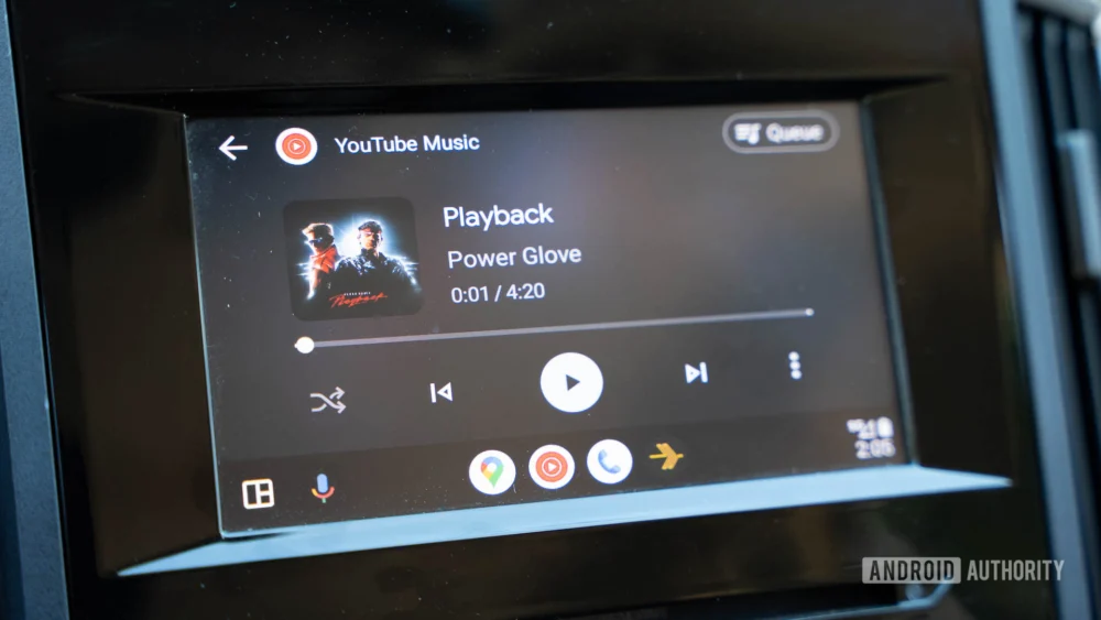
The digital landscape of in-car infotainment systems is notoriously unforgiving. Unlike a smartphone application where a minor visual glitch can be tolerated for a few hours, errors within automotive software carry immediate safety implications. This unforgiving environment appears to be the culprit behind the sudden, unannounced regression observed by a segment of the Android Auto user base: the abrupt disappearance of the recently introduced, visually distinct media playback template, characterized by its fluid, "wavy" progress bar and refreshed layout for applications like YouTube Music.
This visual feature, which signaled a subtle but significant modernization of the user interface (UI) within the vehicle environment, began vanishing from the dashboards of beta testers even while they remained on ostensibly updated software builds. Initial reports surfaced across dedicated community forums, indicating a reversion to the older, flatter, and arguably more utilitarian progress bar design. This phenomenon suggests not merely a UI toggle being flipped off, but a systemic rollback of a feature set that had been partially deployed to users.
The crucial distinction here is that the community consensus points toward this rollback being functionally necessary rather than purely aesthetic. Several experienced users have documented that the adoption of the new media player—which included refined touch targets and reorganized controls—coincided precisely with the failure of essential physical integration points: the steering wheel-mounted media controls. Functions as fundamental as skipping tracks, adjusting volume, or muting playback reportedly ceased responding accurately or entirely when the new UI was active. This breakdown in the critical handshake between the car’s physical controls (the CAN bus interface) and the software running on the head unit is a serious flaw in automotive UX design.
Contextualizing the UI Experiment and Its Failure
Android Auto, Google’s gateway to integrating smartphone functionality safely into the vehicle cockpit, operates under stringent guidelines rooted in minimizing driver distraction. Every element of the interface must prioritize glanceability and predictable interaction. The introduction of the wavy progress bar was part of a broader, ongoing effort to refine the Media Playback Template (MPT), which standardizes how different audio applications present information to the driver. Previous iterations focused heavily on card-based designs and consistent button placement. The newer design seemed to lean into a more modern, fluid aesthetic, perhaps attempting to better align with current Android OS design language.
However, modernizing aesthetics without fully validating the underlying functional integrity—especially concerning hardware integration—is a classic pitfall in software deployment. In the automotive sector, the connection between the infotainment head unit (often running a custom Android fork or proprietary software supplied by the OEM) and the vehicle’s internal control network is complex. The steering wheel controls communicate via standardized protocols that the Android Auto application layer must interpret correctly. If the new MPT changed the expected data structure or the way it registered input events, the legacy communication bridge would naturally break down.
For users, the preference for the new look is understandable. Enhanced touch targets, particularly for services like YouTube Music where queue management and shuffling are frequent actions, promised a smoother, more intuitive experience when stationary or at a stoplight. Yet, this perceived usability enhancement was immediately negated by the inability to control playback without taking a hand off the wheel to interact with the touchscreen—a direct violation of safety-first design principles in vehicle software.
Industry Implications: The Safety-First Mandate in Automotive Software
This incident serves as a potent reminder of the vast chasm separating mobile application development and automotive software engineering. A mobile OS update can afford a degree of instability during an A/B test, often utilizing staged rollouts to mitigate widespread impact. Automotive integration, conversely, demands near-perfect stability from the moment a feature is deployed to a production environment, largely because the user environment (the car) is a high-stakes, dynamic setting.
For OEMs (Original Equipment Manufacturers) and Tier 1 suppliers who build the physical head units, maintaining compatibility with rapidly evolving platforms like Android Auto is a constant balancing act. They must support legacy vehicle models while integrating the newest software features pushed by Google. When a visual update causes hardware controls to fail, it forces the OEM into a reactive state, potentially requiring them to push out their own firmware updates to stabilize the connection—a process that is inherently slower and more cumbersome than a simple Google Play Store update.
Expert analysis suggests that the rollback was likely triggered by automated telemetry or a high volume of flagged error reports specifically tied to HID (Human Interface Device) controls originating from the vehicle’s ECU (Electronic Control Unit) layer. Google’s internal testing for Android Auto must include extensive validation against a diverse fleet of vehicle hardware. The fact that the wavy progress bar made it even partially into beta users’ hands indicates a gap in the testing matrix—perhaps a specific make or model combination that exposed the control incompatibility. The rapid retraction points to a swift recognition that this was a critical failure, not a minor bug.
The Future Trajectory of Android Auto UI Development
The temporary demise of the wavy progress bar is not the end of this design language; it is a data point in a long iterative process. Google is clearly committed to evolving the MPT to create a more visually engaging and functionally efficient media experience. The fact that users appreciated the layout improvements—even while acknowledging the critical flaw—provides valuable positive feedback.
We can anticipate the re-emergence of this design, but likely under a revised implementation strategy. Future rollouts may involve:
- Phased Feature Toggles: Separating the visual refresh from the underlying control handling logic. The new UI might be deployed first only to applications that do not heavily rely on complex physical control mapping, or perhaps restricted initially to vehicles known to support newer communication standards.
- Enhanced Hardware Compatibility Testing: Investing heavily in simulation environments that mimic the precise communication protocols of a broader range of legacy and current vehicles to proactively catch control mapping errors before external release.
- Deep Collaboration with OEMs: Direct collaboration during the feature development phase, ensuring that new UI components are validated against the actual firmware stacks used by major manufacturers.
The trend in in-car technology is undeniably moving toward richer, more integrated experiences that blur the lines between the car’s native system and the smartphone projection. However, this evolution must proceed cautiously. The industry is learning that while a beautiful interface can draw praise, flawless physical interaction remains the absolute baseline requirement for automotive software. Any feature that compromises driver control—even a visually pleasing progress bar—will be immediately and ruthlessly purged from the system.
The brief appearance and swift disappearance of the wavy music player underscores a fundamental truth in the automotive tech ecosystem: aesthetics must always serve safety and core functionality. The community’s preference for reliable track skipping over a dynamic visual element is the clearest possible mandate Google has received. The company will almost certainly revisit this modern design, but the next iteration will need to prove, beyond a shadow of a doubt, that it can coexist peacefully with the steering wheel buttons before it settles permanently onto the dashboard. Until then, drivers are left with the familiar, if less exciting, flat line tracking their journey through the playlist. This temporary regression ensures that when the wavy bar finally returns, it will do so with the necessary stability to support the rigorous demands of the driving environment. The expectation now shifts from mere novelty to proven reliability in the most critical of software domains.
