
The ongoing evolution of Google’s core Android applications continues to prioritize aesthetic modernization aligned with the Material 3 Expressive design language, yet this pursuit of visual polish frequently intersects with deep-seated user interaction preferences. A prime example of this dynamic is unfolding within the Google Clock application. Following a significant visual overhaul that introduced bolder typography, enlarged interactive elements, and more saturated color palettes—a hallmark of the Material 3 Expressive push—a crucial piece of functionality was altered: the intuitive, tactile sliders for alarm dismissal and snooze were replaced entirely by static buttons. This shift, while conforming to a more streamlined, button-centric interface philosophy, generated notable friction among a segment of the user base accustomed to the swiping gesture.
Now, internal code analysis of the burgeoning Google Clock version 8.5 suggests that Google is not merely reverting this decision but is instead embracing a sophisticated form of user-centric accommodation. Evidence points toward the imminent reintroduction of the slider mechanism, crucially framed not as a forced replacement, but as a user-selectable option. This represents a significant pivot in how Google addresses established, yet visually outdated, interaction patterns within its system utilities. Users may soon encounter a new configuration toggle within the Clock settings, explicitly labeled to determine the dismissal mechanism: "Dismiss an alarm with a [choice]." Tapping this setting will likely present a visual preview of both the tactile slider and the currently implemented button interface, allowing the individual user to calibrate the alarm experience to their established muscle memory or current environmental needs.
The Context of Interaction Design and User Habit
To fully appreciate the implications of this potential change, one must examine the context of interaction design theory. The debate between sliders and buttons for binary actions (like dismiss/snooze) is perennial in UI/UX circles. Sliders, historically, offer a sense of continuous control and immediacy; the act of sliding across a distance often feels more deliberate and less prone to accidental activation than a simple tap, especially when groggy. The original swipe-to-dismiss feature, deeply ingrained in early smartphone interaction paradigms, carried significant psychological weight for long-time users.
When Google transitioned to buttons in the Material 3 refresh, the rationale was likely twofold: consistency with the broader Material 3 adoption, which favors discrete, clearly labeled controls, and perhaps an assumed reduction in accidental snoozes or dismissals via imprecise swiping in low-light or half-awake states. However, forcing this change across the board overlooked the principle of ‘user control’—a cornerstone of high-quality software design. For many, the slider was not just a feature; it was a habit, a muscle memory built over years of use across various applications, not just Google’s own. The potential return of the choice mechanism acknowledges that aesthetic uniformity cannot always supersede proven usability heuristics anchored in user familiarity.
Industry Implications: The Material 3 Balancing Act
This development within Google Clock has broader ramifications for the mobile technology industry, particularly for companies aggressively adopting sweeping design systems like Material You/3. Large-scale design language overhauls, while necessary for modernization and visual cohesion, often encounter resistance when they alter fundamental, deeply familiar interactions.
What Google appears to be prototyping is a nuanced approach: achieving the visual goal of Material 3 Expressive (modern look, vibrant colors, updated components) while simultaneously offering graceful degradation or customization for legacy interaction patterns. If this user-choice setting becomes standard, it sets a precedent that even within highly opinionated design frameworks, core utility functions must remain adaptable to user preference. Competitors and developers across the ecosystem will observe this implementation closely. It suggests a maturation in Google’s approach—recognizing that true expressiveness involves catering to individual user workflows, not just applying a universal visual theme.
Furthermore, the introduction of an explicit settings option forces transparency regarding interaction methods. Instead of a silent deprecation of a feature, users are being asked directly how they wish to engage with their alarm interruption. This transparent configuration management is a subtle but important shift in platform governance.
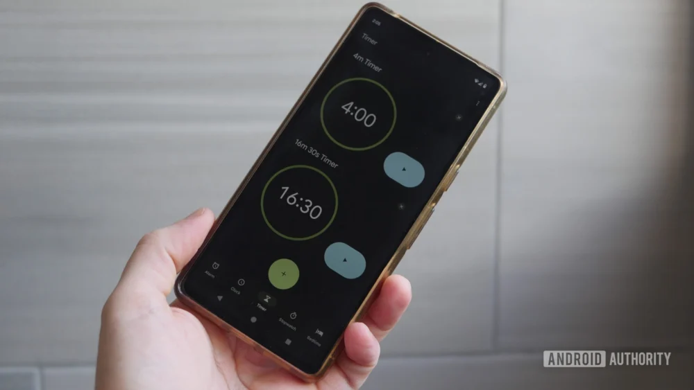
Deeper Dive into Accompanying Updates in Clock 8.5
Beyond the headline-grabbing return of the slider option (which remains in a testing phase and is subject to eventual deployment), the current build of Google Clock 8.5 is shipping with several tangible refinements that continue the Material 3 integration and enhance utility.
One notable enhancement is found within the volume control settings. Consistent with the Material 3 emphasis on tangible visual feedback, the alarm volume slider bar itself has been augmented. It is now rendered visibly thicker, providing a more substantial target for interaction. More importantly, as the user manipulates the slider handle, the precise volume level—presumably represented numerically, likely in decibels (dB) or a standardized 0-100 scale—is displayed dynamically. This moves the control from an abstract visual representation to a precise calibration tool, which is critical for users sensitive to sound levels, whether they require maximum volume or need to ensure their alarm remains below certain thresholds for shared living situations.
Another area receiving targeted refinement is the stopwatch functionality, specifically concerning lap time management. While the traditional method of tracking laps involves scrolling through the recorded times, the new iteration integrates dedicated, diminutive arrow buttons adjacent to the lap time display. These subtle navigational controls allow for discrete, step-by-step scrolling through recorded intervals. This addition addresses a common usability bottleneck: precise scrolling, especially on smaller screens or when a user’s touch input might be slightly unsteady, can be difficult. These small arrows offer a high-precision alternative to the broader, less granular scrolling gesture, catering to athletes or professionals who require meticulous review of timed segments.
It is crucial to delineate the status of these features. The volume slider enhancement and the lap time scroll arrows are already embedded within the released Google Clock 8.5 APK, accessible via direct sideloading or through incremental rollout on the Google Play Store. They are active features awaiting public validation. Conversely, the alarm dismissal choice mechanism is currently observable only through rigorous APK teardown analysis, signifying work-in-progress code that has not yet been activated for general testing or public release. As always with such preliminary findings, the possibility remains that development priorities could shift, leading to the abandonment of the selection feature before it reaches a stable public build.
Future Impact and Trends: Customization as the Next Frontier
The trajectory indicated by these Clock updates suggests a significant future trend in system application development: the prioritizing of interaction customization over monolithic design adherence. For years, operating system updates centered on making the entire UI look and behave uniformly. While this provides a cohesive experience, it often sacrifices flexibility for the power user or the user with specific accessibility needs.
The potential introduction of a toggle for the alarm dismissal method foreshadows a broader shift where system applications—especially those dealing with highly frequent, high-stakes interactions like alarms and notifications—will offer deep configurability regarding gesture and input type. We might anticipate similar dialogues emerging for other system utilities: offering a choice between gesture navigation and classic three-button navigation within certain contexts, or allowing users to select between different feedback mechanisms for text input confirmation.
This iterative approach—releasing a major design overhaul, absorbing user feedback (sometimes critically), and then strategically reintroducing choice—is a mature method of product iteration. It allows Google to update the visual identity of Android rapidly while mitigating the alienation of long-term users whose workflows depend on older interaction models. The success or failure of the slider/button choice in Google Clock will serve as a critical data point for how Android continues to balance its ambitious visual future with the practical realities of daily user interaction. The ultimate goal is to create an interface that feels both stunningly modern and intrinsically familiar, a delicate equilibrium that this latest development in the humble Clock app seems determined to achieve.