
The ongoing evolution of mobile operating systems frequently centers on subtle yet impactful user experience refinements, particularly where digital identity and first impressions are concerned. Google’s implementation of "Calling Cards," a feature heavily inspired by the personalized contact presentation capabilities pioneered by Apple’s iOS Contact Posters, represents a significant step toward making the Android calling experience more visually rich and customizable. However, initial deployment presented a notable friction point: the management interface for these cards was siloed exclusively within the Google Phone application. This architectural decision, while perhaps logical from a functional telephony perspective, contradicts established user expectations that contact-related customization should reside within the central Contacts repository. Recent deep-dive analysis of preparatory code within the latest builds of the Google Contacts application strongly suggests that Google is actively working to dissolve this interface barrier, promising a more intuitive user journey for managing these crucial visual identifiers.
The Context of Calling Cards and Ecosystem Fragmentation
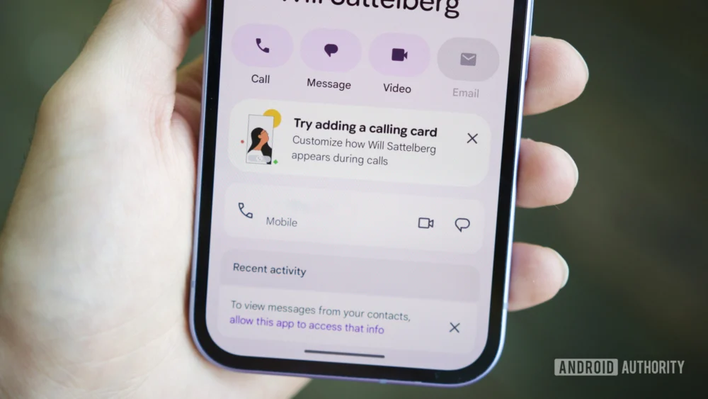
Calling Cards arrived on Android as a direct response to the personalized caller ID trend. They allow users to design a visually distinct screen that appears on the recipient’s device when a call is placed, complete with custom backgrounds, unique typography, and profile imagery. This feature aims to move beyond the static, utilitarian display of names and numbers, transforming the initial moments of a call into a branded interaction. For many users, this digital business card is an extension of their personal or professional identity.
The critical issue, as often happens in the complex ecosystem of Google services, was the operational split. While the data for contacts resides in Google Contacts, the presentation layer for Calling Cards was initially nested deep within the settings menu of the Google Phone application. Accessing this feature required navigating away from the primary contact management hub, a workflow that felt inherently inefficient. This fragmentation often leads to decreased feature adoption, as users either forget the feature exists or become frustrated by the unintuitive path required to set it up or modify it.
The discovery within Google Contacts version v4.72.5.862509763 points to the integration of a dedicated entry point for Calling Cards, likely positioned under the "Organize" tab. This modification is not merely a cosmetic addition; it represents a philosophical acknowledgment of user interface logic. By creating a direct hyperlink within Contacts that seamlessly launches the Calling Card configuration screen within the Phone app, Google bridges the functional gap. This "deep linking" approach ensures that users manage their contact identity where they manage their contact data. This is a vital lesson learned from early user feedback loops: features closely tied to contact management must be surfaced where contacts are managed.
Industry Implications: Harmonizing Identity Across Platforms
This move has broader implications for how Google structures its core communication suite. In the modern smartphone landscape, the distinction between the Dialer/Phone app and the Contacts app is increasingly blurred. Users see them as components of a single communications platform. Competitors, particularly Apple, have tightly integrated these functions, making the customization of caller presentation feel native and accessible.
For Android manufacturers and developers relying on Google’s framework, this integration sets a precedent. It signals a future where core identity features, regardless of which application technically executes the function (dialing vs. storing), must have unified access points. This approach reduces cognitive load for the end-user and promotes feature discoverability, which is paramount for a feature like Calling Cards that relies on peer adoption to maximize its effect. If setting up a card is cumbersome, fewer people will do it, resulting in a less vibrant calling screen ecosystem overall.
Furthermore, this refinement addresses a specific, known criticism of the initial rollout. By making setup easier, Google lowers the barrier to entry, potentially increasing the number of users actively curating their visual call presence. This is crucial for competitive parity and for establishing Calling Cards as a core Android feature rather than a niche add-on.
Expert Analysis: The Material 3 Expressive Overhaul
Concurrent with the shortcut integration, deeper exploration of the Google Phone application (specifically version v208.0.864581421) reveals a sustained commitment to migrating legacy UI elements to the latest aesthetic standard: Material 3 Expressive.
Material Design 3 (M3) emphasizes personalization, dynamism, and accessibility through color. The "Expressive" variant, in particular, focuses on leveraging color and gentle motion to create interfaces that feel vibrant yet structured. While much of the Google Phone app has already adopted this modern look, certain auxiliary settings screens, often those untouched since earlier Android versions, retained older, more utilitarian designs.
The teardown reveals specific updates targeting the "Call Screen" settings section. The most noticeable change appears to be the simplification and restructuring of these configuration pages using card-based layouts inherent to M3. The removal of older, potentially jarring top-area animations in favor of clean, contained cards contributes to a less visually noisy environment. In technical terms, this migration suggests Google is not just patching functionality but is undertaking a comprehensive design modernization across its entire utility suite.
From a UX perspective, this consistency is vital. When an application utilizes heterogeneous design languages—mixing older Android components with cutting-edge Material 3—the experience feels disjointed, signaling instability or incompletion. By methodically converting settings panels to the M3 Expressive paradigm, Google reinforces a cohesive brand language across its essential services. The card-based approach inherently improves scannability, allowing users to process options more quickly, a significant benefit for settings pages that are accessed infrequently but need clarity when they are.
Future Impact and Evolving Trends in Digital Presence
The dual development tracks—improved access to Calling Cards and the aesthetic overhaul of the Phone app—point toward a broader strategic objective for Google: asserting dominance in the visual layer of digital communication. The trend is moving definitively away from pure functionality toward contextual identity presentation.
-
Contextual Calling: The next logical evolution will likely involve contextual Calling Cards. Imagine a system where the card automatically switches based on the recipient. A professional contact might receive a business-focused card, while a family member receives a more casual, personal design, all managed through the newly streamlined Contacts integration. This requires robust, easily accessible management tools, which the proposed shortcut directly facilitates.
-
Cross-App Identity Synchronization: If Calling Cards are successful, expect Google to push this concept to other communication vectors. Will we see "Messaging Cards" that appear at the top of a Google Messages thread, or perhaps integrated identity displays within Google Meet? Standardizing the management pathway via Contacts makes future feature expansion significantly cleaner. The Contacts app could evolve from a mere data repository into the central "Identity Management Console" for the entire Google mobile stack.
-
Enhanced Interoperability: While Calling Cards are currently peer-to-peer within the Android ecosystem (or when calling an iOS user who has Contact Posters enabled), future developments might push for richer, standardized metadata sharing during the initial call handshake. The clearer the interface for users to create this metadata (via the new shortcut), the more data Google will have available to leverage in future AI-driven communication tools, such as advanced spam filtering or call screening based on known visual profiles.
The work discovered in the latest builds—a navigational bridge between Contacts and Phone, coupled with the visual polishing of the Phone app—demonstrates a calculated effort to mature the Calling Cards feature. It suggests Google is moving this capability from an experimental feature to a fully integrated, user-friendly pillar of the Android communication experience, prioritizing accessibility and modern design parity across its essential mobile applications. These incremental but significant updates signal a sustained commitment to making the first few seconds of any phone call a curated, personalized experience for all Android users. The completion of these updates will represent a significant step forward in Android’s visual sophistication and usability coherence.