
The recent, widespread rollout of dynamic theming within the Google Photos editing suite marks a subtle yet significant evolution in user interface design philosophy for one of the world’s most utilized photo management platforms. Previously, the editing environment within Google Photos maintained a steadfast, dark-gray backdrop, a design choice long favored in creative applications for its ability to minimize visual interference when assessing subtle color shifts and contrast ratios in photographs. This dark mode predominance was intuitive for low-light editing sessions, but it created a noticeable visual disconnect for users who preferred, or were mandated by organizational policy, to operate their entire mobile ecosystem in a light theme.
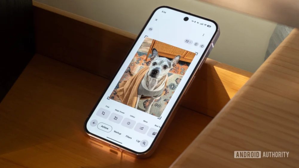
The update, currently propagating across Android versions 7.59 and 7.60 of the application, enforces a synchronous relationship between the phone’s operating system theme setting and the editor’s interface palette. When a user’s device is set to dark mode, the editor remains the familiar charcoal gray. Conversely, activating the system-wide light theme immediately prompts the editor’s background to transition to a light gray or off-white hue, directly reflecting the overarching aesthetic choice of the device. This change, which appears to be driven by a server-side configuration push rather than a mandatory application update, suggests a mature commitment by Google to cohesive cross-application experiences.
Contextualizing the Design Shift: Dark vs. Light in Digital Editing
The long-standing preference for dark interfaces in image manipulation software is rooted in psychophysics. A dark background provides a high degree of contrast against the typically brighter image content being viewed. This "neutral ground" is crucial for calibration; when the surrounding interface is dim, the viewer’s eye focuses more intently on the luminance and saturation levels displayed within the image itself. If the surrounding environment—the UI—is bright, it can cause chromatic aberration or visual fatigue, leading editors to mistakenly over-saturate or over-brighten images to match the perceived brightness of their surroundings.
However, the modern mobile user experience is increasingly bifurcated. Many users, particularly in brightly lit environments or those with specific accessibility requirements (such as certain forms of visual impairment or light sensitivity exacerbated by screen glare), prefer a light theme across all applications. For these users, switching into the Google Photos editor—which previously forced a switch to a dark environment regardless of their system setting—was an abrupt interruption. This forced context switch created a cognitive burden.
The new dynamic theming bridges this gap. It acknowledges that for many users, the primary goal of mobile photo editing is rapid, casual enhancement rather than deep, professional color grading. In a bright environment, a light-themed editor can actually aid in judging how the finalized image will appear when shared on lighter platforms, such as standard web browsers, messaging apps, or even the main Google Photos feed itself. The original rationale for the dark editor—minimizing eye strain in the dark—is now balanced against the reality of modern multi-context usage patterns.
Industry Implications: The Rise of Contextual UI Consistency
This development within Google Photos is not merely a cosmetic adjustment; it reflects a broader industry trend toward hyper-contextual user interface design, often termed "adaptive UIs." For years, operating systems like Android and iOS have offered robust dark/light mode toggles. Initially, applications implemented these settings independently. A user might enable system-wide dark mode, but a specific application might lag, creating jarring visual "islands" of light mode within an otherwise dark experience, or vice versa.
Google’s move here signifies a commitment to fully honoring the system-level declaration. This has significant implications for platform cohesion:
- Developer Expectations: It sets a higher standard for third-party developers utilizing Google’s Material Design principles. If a core Google application like Photos adopts strict adherence to system theming, it reinforces the expectation that other apps should follow suit to maintain a seamless Android experience.
- Accessibility Compliance: While dark mode aids some, light mode is critical for others. By respecting the system setting, Google Photos is making a proactive move toward better supporting diverse user needs without requiring granular, in-app accessibility overrides for basic UI color.
- Reducing UI Friction: The prior need for manual adjustment or dealing with conflicting themes created friction. By automating this choice, Google streamlines the editing workflow, allowing users to focus on image content rather than interface configuration.
The absence of an explicit in-app toggle to override the system setting is noteworthy. This decision suggests a strong editorial stance: the user’s system-wide preference is the definitive choice for the editor. While power users might eventually lobby for an override, the current implementation prioritizes uniformity and simplicity over granular control, suggesting Google believes that for 99% of use cases, system adherence is the optimal path.
Expert Analysis: The Perception of Image Quality and Environmental Influence
From a perceptual psychology standpoint, the light editor background introduces a new set of variables for judging image quality. When an image is surrounded by a light field, the perceived brightness of the image tends to decrease—a phenomenon known as simultaneous contrast. If a user adjusts the exposure of a photograph against a light background, they may inadvertently push the shadows too dark or the highlights too subdued, aiming for a look that contrasts well against the light UI, but which then appears flat or underexposed when viewed in the standard dark interface or printed.
Conversely, when editing against a dark background, the surrounding darkness exaggerates the brightness of the image, potentially leading users to dial down highlights excessively. The ability to switch between these two visual contexts—dark for deep contrast analysis, light for real-world output simulation—is highly beneficial, provided the user consciously understands the perceptual shift.
The journalistic observation that the light editor might make images "look dull when shared in an app that has a lighter interface" underscores this point. If a user edits against a dark background, the image looks vibrant. When they post it to a lighter social media feed, the image appears appropriately balanced. If they edit against a light background, they might compensate by making the image brighter, only for it to appear slightly blown out or overly luminous when viewed on a standard white-background webpage. The implementation forces users to consider the final viewing context more actively.
Future Trajectory: Deeper Customization and AI Integration
This theming evolution is likely a stepping stone toward more sophisticated customization options within Google Photos. As AI-driven editing features become more prevalent—such as generative fill, advanced subject isolation, and automated cinematic effects—the UI must adapt to present complex tools without overwhelming the user.
- Granular Tool Theming: Future iterations might allow users to theme individual editing panels independently of the main background. For instance, the exposure slider panel could retain a neutral gray, while the main canvas background dynamically switches.
- AI Context Awareness: Advanced photo platforms are beginning to leverage on-device sensor data. It is plausible that Google Photos could eventually use ambient light sensors (if permitted by the user) to suggest an optimal editor theme, moving beyond the static OS setting. If the phone detects bright sunlight, it might suggest the light theme for better visibility, overriding the system setting temporarily.
- Professional Tier Differentiation: As Google continues to refine its subscription offerings (Google One), we might see professional-grade editing modes that default to a strictly calibrated, non-theming environment, reserved for users who require absolute consistency across all platforms, desktop and mobile alike. The current dynamic theme serves the mass market perfectly, but professional needs often require static environments.
The rollout across multiple versions via a server-side switch indicates that Google is testing the waters for wider adoption of dynamic UI elements that respect holistic device settings. It signals maturity in their design language, moving away from rigid, application-specific visual rules toward an integrated, user-centric experience that flows naturally with the operating system’s established preferences. For the average user, this means fewer visual surprises when diving into the editing suite, resulting in a more harmonious and less fatiguing mobile photography experience. The adjustment, while subtle in isolation, is a clear indicator of Google’s commitment to platform-level design synergy across its vast ecosystem.