
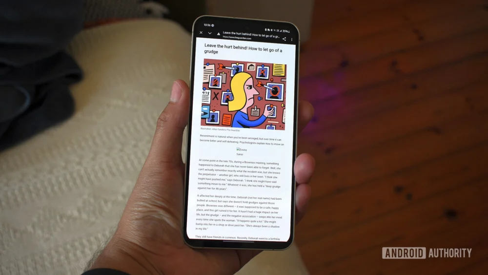
The functionality long promised by Chrome’s built-in Reading Mode on Android—a clean, distraction-free environment for consuming long-form web content—has historically been plagued by an almost capricious implementation. For years, users have contended with a feature that appeared arbitrarily, often disappearing mid-session or failing to activate on pages clearly intended for simplified consumption. This inconsistency turned a potentially powerful productivity tool into little more than a forgotten novelty, buried beneath layers of navigational clutter and contingent on Google’s opaque algorithmic assessment of a webpage’s suitability. However, emerging testing within recent builds of Chrome suggests a significant paradigm shift is underway, one that addresses the core usability deficits that have sidelined this feature since its inception. This evolution signals a renewed commitment by Google to user-centric design principles in mobile browsing, moving Reading Mode from a sporadic utility to a consistently accessible staple.
Addressing the Reliability Crisis: A Foundational Shift in Access
The most immediate and welcome change observed in the nascent rollout is the fundamental alteration in how a user invokes Reading Mode. Previously, the feature relied heavily on a contextual prompt—often a small icon appearing near the address bar—that served as a visual suggestion rather than a guaranteed option. This unreliable appearance fostered user frustration, as the window of opportunity to activate the mode was fleeting and entirely dependent on the browser’s internal parsing logic.
The updated approach, reportedly visible in testing builds, relocates the invocation mechanism directly into the established overflow (three-dot) menu. Crucially, it is now positioned with dependable consistency, situated immediately following the "Listen to this page" option. This placement elevates Reading Mode from an ephemeral suggestion to a deliberate, user-initiated action, placing control squarely in the hands of the consumer. This move is significant because it acknowledges that user intent, not algorithmic guesswork, should govern the activation of core utility features. By standardizing the location within the primary settings nexus, Google is effectively ensuring that users who seek out this functionality can find it every single time they navigate to a suitable article, regardless of the site’s specific formatting quirks.
Furthermore, the transition experience itself has undergone a critical redesign. Older iterations of Reading Mode often enacted a jarring, full-screen takeover, effectively ejecting the user from the standard browsing context. While this offered deep focus, it simultaneously severed the connection to familiar navigational anchors like the address bar and persistent tabs, forcing a conscious ‘exit’ process when the user finished reading. The newly surfaced implementation reframes Reading Mode as a non-disruptive overlay. The underlying webpage remains partially visible, and critically, the address bar persists. This architectural decision transforms the experience from a binary state (browsing vs. reading) into a layered environment. It fosters a sense of continuity, allowing users to quickly reference the URL, switch tabs, or revert to the standard view without the friction associated with a complete contextual switch. For mobile users juggling multiple tasks, this minor navigational modification represents a substantial enhancement in workflow efficiency.
Embracing Modern Aesthetics: Material 3 Expressive Integration
Beyond functional accessibility, the visual overhaul of the Reading Mode controls reflects Google’s broader commitment to its contemporary design language. The interface now fully integrates elements of Material 3 Expressive, moving away from the flatter, somewhat utilitarian aesthetic of its predecessor. The customization panel has been recast as a substantial bottom sheet, characterized by generously rounded containers and distinct visual separation between controls. This shift not only aligns the feature with the current design ethos across Android but also measurably improves the perceived clarity and tactile quality of the interaction points.
The core customization parameters remain robust, catering to diverse visual preferences and accessibility needs. Users retain the ability to toggle between distinct font families—sans-serif, serif, and monospace—catering to different reading speeds and cognitive preferences. The text scaling capability, which allows magnification up to 250%, remains a vital tool for users with varying degrees of visual acuity. Color themes—the classic light mode, a warm sepia tone, and a true dark mode—ensure comfortable reading under disparate ambient lighting conditions, from bright sunlight to late-night sessions. The significance here is that Google has not merely refreshed the skin; it has ensured that the functional controls necessary for personalization are presented within a framework that is both modern and intrinsically easier to parse visually.
Industry Implications: The Battle for Attention in the Attention Economy
The revitalization of Reading Mode carries implications that extend beyond mere user interface tweaks; it touches upon the broader industry trends surrounding content consumption and the attention economy. In an era saturated with aggressive advertising, intrusive pop-ups, and content optimized for click-through rates rather than comprehension, dedicated reader utilities serve as a crucial counter-measure.
For major browser developers like Google, offering a reliable, built-in mechanism to strip away web detritus is a powerful differentiator. It positions the browser not just as a conduit to the web, but as a curator of the user experience. Competitors, including Apple’s Safari with its established Reader View, have long capitalized on this functionality. Google’s historical weakness here allowed a perception to solidify that Chrome was less concerned with deep reading and more focused on speed and feature density. By seriously iterating on this feature, Google is directly challenging that perception, aiming to capture the segment of mobile users who prioritize focused, long-form reading.
Moreover, this move indirectly puts pressure on publishers. While many reputable news organizations strive for clean presentation, the constant pressure of digital monetization often leads to design choices that degrade readability (e.g., excessively narrow columns, high-contrast text, or aggressive ad integration). A highly effective, native reader mode within the dominant Android browser provides users with an accessible "escape hatch." If users become accustomed to invoking this mode reliably, publishers may face subtle, indirect pressure to ensure their core content structure is robust enough to survive the cleansing process, or risk having their carefully designed layouts completely bypassed.
Expert Analysis: The Strategic Value of Feature Parity and Flag Testing
The current rollout methodology—identified on stable Chrome 143 builds but requiring manual activation via the chrome://flags/#reader-mode-improvements setting—is characteristic of Google’s strategic software deployment cycle. This "flag testing" phase serves multiple expert-level functions.
Firstly, it allows for large-scale, real-world stress testing without impacting the entire user base. Reading Mode’s effectiveness hinges on its ability to correctly parse the Document Object Model (DOM) of millions of unique web pages. Flagging the feature isolates the test group, enabling rapid iteration on parsing algorithms based on diverse feedback before a full production deployment.
Secondly, it manages user expectation. By making the feature opt-in initially, Google avoids widespread complaints if the parsing engine occasionally misinterprets a complex site layout during this testing phase. It signals to power users and tech enthusiasts that significant work is being done, while preserving a baseline stability for the general population.
From a design perspective, the move to an overlay rather than a full context switch speaks volumes about modern mobile usability philosophy. Contemporary mobile operating systems favor fluid transitions and persistent contextual awareness. Pulling the user entirely out of the browser frame—even for a noble purpose like reading—introduces cognitive overhead. The overlay structure respects the modern expectation that the application environment should remain largely intact, even when a specific content presentation layer is activated. This mimics successful patterns seen in features like picture-in-picture video or persistent notification shade interactions.
Future Trajectories: AI Integration and Content Curation
Looking ahead, the improved scaffolding of this Reading Mode sets the stage for deeper, potentially AI-driven enhancements. If the foundation for reliable content extraction is firmly established, Google has a clear path to integrate more sophisticated processing tools.
One immediate future trend could involve integrating generative AI capabilities directly into the reading pane. Imagine a scenario where, after stripping away boilerplate, the user could prompt the browser: "Summarize the main arguments of this article in five bullet points," or "Extract all cited statistics." Since the browser has already isolated the core textual content, this extraction task becomes significantly simpler for the underlying language models.
Another potential evolution lies in personalized curation. If Reading Mode becomes a habitually used feature, Google gains valuable telemetry on what types of content (based on structure and topic) users prefer to consume in a simplified format. This data could be used to subtly influence future content surfacing algorithms in Google Discover or Search results, prioritizing articles that are demonstrably better formatted for focused consumption, thereby nudging the web ecosystem toward better content hygiene.
Furthermore, as mobile devices become increasingly powerful, there is scope for enhanced customization beyond mere text size and color. Future iterations might introduce dynamic column width adjustments based on device orientation and screen real estate, or perhaps even advanced typographic controls that mimic professional typesetting standards, moving closer to a true digital book experience rather than just a stripped-down webpage.
In conclusion, the reported redesign of Chrome’s Android Reading Mode represents far more than a cosmetic update. It addresses a long-standing functional liability, aligns the browser with contemporary mobile interaction paradigms, and strategically positions Google to leverage emerging AI capabilities within the context of content consumption. By transforming Reading Mode from an elusive gimmick into a reliable, integrated tool, Google is making a substantial investment in improving the fundamental act of reading on the world’s most prevalent mobile operating system. The success of this rollout will be measured not just by user satisfaction surveys, but by the sustained frequency with which Android users choose to engage with long-form content distraction-free.
