
The digital living room experience, anchored by platforms like Google TV, is often defined by the delicate balance between feature density and intuitive usability. While the streaming landscape frequently anticipates headline-grabbing overhauls—the sweeping redesigns that fundamentally alter navigation or content discovery—the true measure of platform maturity often lies in the iterative refinements that address persistent user friction points. Google TV, currently navigating a phase characterized by measured, incremental enhancements rather than radical shifts, is deploying a minor but significant software update, version 1.0.852105632 for the Google TV Home application, that subtly but effectively polishes the user experience for connected entertainment consumers.
This latest rollout, while deliberately understated compared to the rumored, large-scale interface transformations that have been circulating in beta testing environments for months, delivers two specific corrections that target common points of frustration within the established Google TV ecosystem. These adjustments underscore a commitment to platform hygiene—the necessary maintenance that ensures the foundational elements of the interface operate seamlessly, even as the platform matures toward its next major architectural phase.
The Context: Google TV’s Evolutionary Plateau
To fully appreciate the significance of these minor fixes, one must contextualize Google TV’s current development cycle. Since its inception, Google TV—the successor to the more utilitarian Android TV—has strived to become a centralized content hub, aggregating recommendations and live linear programming alongside on-demand services. This aspiration requires constant recalibration of algorithms, content placement, and visual presentation.
However, the development of such complex, heavily personalized platforms often results in periods of consolidation. Following major feature introductions—such as the integration of live TV channels or the implementation of robust profiles—there is an inevitable phase where engineering resources pivot toward stability, performance optimization, and addressing the specific usability complaints logged by the active user base. The current software push appears to firmly belong to this consolidation period. It suggests that while the vision for a completely revamped top-tier navigation structure—which includes testing for reorganized tabs and streamlined pathway access—remains active and progressing through staggered rollouts, the immediate priority is eliminating the small annoyances plaguing daily interaction. This strategic sequencing is common in mature software development: stabilize the core experience before launching the next generation of features.
The First Key Change: Enhanced User Feedback Transparency
One of the most notable additions within version 1.0.852105632 is the introduction of a "Report history" option nested within the Accounts & Profiles configuration menu. While the precise functionality remains subject to confirmation from official Google documentation, the implication, as observed by community members tracking early deployment via platforms like Reddit, is a vital enhancement to user accountability and feedback loops.
Historically, when users encounter bugs, glitches, or unsatisfactory content curation on their smart TV interfaces, the process of reporting that issue often feels opaque. A user submits diagnostic data, perhaps a brief textual description of the problem, and then the report vanishes into Google’s engineering pipeline. The inclusion of a dedicated "Report history" feature suggests a move towards greater transparency.
Expert Analysis on Feedback Mechanisms: In platform development, the perceived value of user feedback is dramatically increased when users see evidence that their contributions are logged and potentially tracked. This feature is less about solving a visual bug and more about improving the relationship between the platform steward (Google) and the end-user. From a product management perspective, this builds crucial user loyalty. Users who feel heard are more likely to remain engaged and tolerant of ongoing developmental hiccups. Furthermore, it allows power users who frequently submit detailed bug reports to maintain an internal ledger of their reported issues, facilitating better follow-up communication should Google decide to implement a direct resolution notification system tied to this history log. This elevates the simple act of reporting a problem into a documented, traceable interaction.
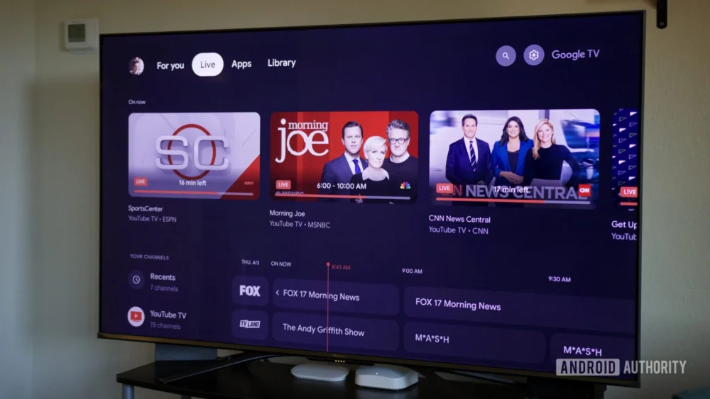
The Second Key Change: Rectifying Visual Inconsistencies in Content Presentation
The second, and perhaps more immediately gratifying, adjustment targets the visual fidelity of recommended content tiles, specifically those sourced from the YouTube application. A long-standing aesthetic grievance among Google TV users has been the occasional distortion or stretching of thumbnail images appearing within the personalized recommendation rows on the home screen. This issue often manifests when the system struggles to correctly map the aspect ratio of a video thumbnail to the fixed dimensions allocated for a content card, resulting in an unnatural, elongated appearance.
The new update appears to correct the underlying logic governing these display parameters. Reports indicate that the problematic stretched thumbnails are now absent, replaced by smaller, correctly proportioned images.
Implications for UI/UX: This correction, while seemingly minor, speaks volumes about the platform’s dedication to visual coherence. In a highly competitive streaming environment, where competing platforms (Roku, Apple TV, Amazon Fire TV) are constantly iterating on their visual language, visual artifacts like stretched images degrade the perceived quality of the entire operating system. Consumers interact with media through visual cues; if the presentation itself is flawed, the perceived value of the content recommendations diminishes.
By standardizing the thumbnail size and ensuring correct aspect ratio rendering, Google is subtly enhancing the perceived professionalism of the Google TV interface. It reinforces the platform’s identity as a premium aggregator, moving away from the appearance of hastily stitched-together components toward a unified design language. This is a crucial step in maintaining parity with competitors whose interfaces prioritize flawless visual delivery.
Industry Implications: The Value of Micro-Updates in the Streaming Wars
The contemporary streaming industry is characterized by a dual approach to software updates: the "Big Bang" feature release and the continuous stream of "Quality of Life" (QoL) patches. Google TV’s current strategy leans heavily into the latter.
The industry implication here is clear: user retention is increasingly dependent on reducing frustration overhead. While a new tab structure or a radically different recommendation engine might attract initial media attention, daily usage patterns are more heavily influenced by small, persistent irritations. A platform that allows visual glitches or provides no mechanism for tracking user feedback will bleed engaged users to platforms that offer a smoother, more responsive experience, even if those competitors lack one or two key features.
This update positions Google TV as a platform that is actively listening to the granular details of its user base. It suggests a sophisticated approach to development where infrastructure maintenance and user satisfaction metrics are weighted heavily, even outside the spotlight of major announcements. This methodical patching approach builds a bedrock of stability that will better support the more ambitious, sweeping interface changes currently being tested in the background.
Looking Ahead: The Unfolding Major Redesign
It is critical to remember that these QoL fixes are occurring concurrently with ongoing A/B testing of a more substantial Google TV overhaul. This larger redesign, which aims to fundamentally reorganize the primary navigation elements (the top-level tabs), is anticipated to roll out more broadly throughout the coming year.
The relationship between the current patch (v1.0.852105632) and the future redesign is symbiotic. The fixes implemented now—the streamlined settings management and the visual corrections—serve to stabilize the existing environment, making the transition to the new navigation scheme smoother when it arrives. If the foundation were riddled with minor bugs, introducing a major navigational shift would likely amplify user confusion and resistance. By cleaning up the known irritants first, Google is preparing the ground for a more receptive audience when the headline features eventually drop.
We can anticipate that the next wave of major updates will likely focus on how users discover content across different subscription silos, potentially refining the "For You" tab or creating more dynamic ways to switch between live and on-demand viewing modes. However, the success of those large-scale efforts will ultimately depend on the underlying stability provided by updates such as this recent one.
In conclusion, the deployment of Google TV Home app version 1.0.852105632 is a testament to the principle that excellence in user experience often resides in the details. By addressing the obscure administrative need for feedback tracking and eliminating distracting visual artifacts, Google is executing a quiet but essential maintenance routine, ensuring that the platform remains a polished and reliable portal for home entertainment consumption as it prepares for its next major leap forward in the competitive landscape of connected television. These two changes, though small in scope, contribute significantly to the overall trustworthiness and enjoyment of the Google TV environment.
