

The contemporary digital ecosystem is characterized by an almost overwhelming proliferation of features and functionalities within everyday applications. This trend, often framed as continuous improvement or feature expansion, frequently results in cognitive overload for the end-user. The pursuit of the "next best thing" in productivity software often leads users down rabbit holes of customization and complexity, paradoxically diminishing the very efficiency they sought. This phenomenon has catalyzed a counter-movement: Digital Minimalism. This philosophy advocates for a deliberate, intentional use of technology, prioritizing tools that serve core, essential functions while ruthlessly eliminating digital noise.
The background context for this shift is crucial. We are living through an era of peak application saturation. Every service attempts to become an all-in-one platform—a note-taking app morphs into a project management suite, a simple messaging client integrates commerce, and operating systems layer ever-deeper settings menus. For professionals, knowledge workers, and general consumers alike, this means spending significant mental bandwidth not on the output of work, but on the maintenance of the tools themselves. The initial investment in complex systems, like highly structured organizational software, creates a sunk cost fallacy, compelling continued engagement even when the system becomes burdensome. This perpetual tweaking replaces actual progress, leading to what could be termed "productivity paralysis."
This article examines a curated suite of five applications that embody the principles of digital sobriety. These are not merely stripped-down versions of popular tools; they are applications where simplicity is the core design mandate, offering high utility with minimal cognitive friction. This selection is grounded in the belief that technological utility is inversely proportional to the number of features offered past a certain threshold.
Industry Implications: The Feature Creep Dilemma
The software industry, particularly in the productivity and lifestyle sectors, has long operated under the assumption that "more features equal more value." This drives subscription models and perceived differentiation in crowded markets. However, this relentless "feature creep" is now encountering significant resistance. Users are increasingly aware of the opportunity cost associated with adopting complex software.
For developers, the implication is clear: there is a growing, profitable niche for tools that prioritize performance, speed, and singular focus. The market is signaling a desire for excellence in one domain rather than mediocrity across several. This presents an interesting tension for large platform holders, like those controlling major mobile operating systems, whose default applications often lean toward feature parity with competitors, thereby embedding complexity by default. The rise of third-party minimalist alternatives forces incumbents to either simplify or risk losing users who prioritize mental clarity over endless options.
Pillar One: Google Keep – The Digital Sticky Note Reimagined
In the realm of quick capture and ephemeral organization, the complexity of modern note-taking suites becomes an active detriment. The transition from a sprawling, interconnected knowledge base like Notion back to a foundational tool like Google Keep illustrates this principle perfectly.
Keep’s strength lies in its immediate accessibility and its structural resemblance to analog methods. It functions as a digital corkboard. Users can quickly jot down thoughts, convert text to checklists, or set location-based reminders without navigating deep menu hierarchies. The primary organizational mechanism—color-coding and simple, descriptive labels—avoids the need for nested databases or complex relational structures.
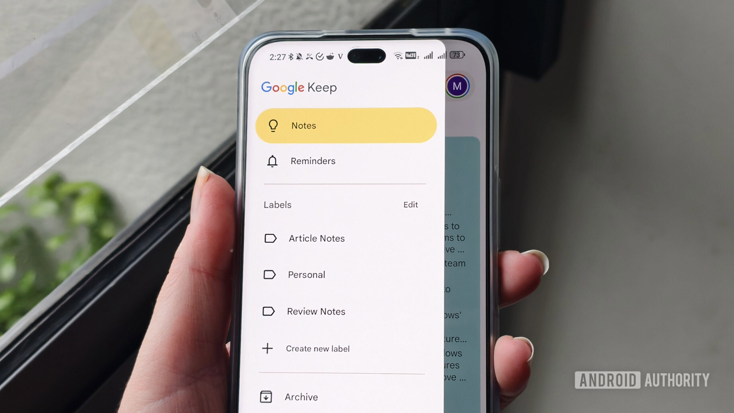
Expert Analysis: From a cognitive perspective, Keep minimizes context switching. When a thought arises, the user opens Keep, records it, and closes it. The barrier to entry (the time between thought and recording) is minimal. In contrast, opening a database-driven application often prompts a secondary decision: "Which database should this go into? Should it be linked to Project X or related to Concept Y?" Keep bypasses this analysis paralysis. While it integrates with Google Tasks, its fundamental utility remains rooted in rapid, low-friction ideation and short-term reminders, serving as the perfect digital scratchpad that doesn’t demand perpetual maintenance.
Pillar Two: Niagara Launcher – Redefining Mobile Interaction
The smartphone homescreen is perhaps the most significant source of digital distraction. Traditional launchers encourage visual clutter through dense icon grids, animated widgets, and endless scrolling pages—all designed to maximize engagement time. Niagara Launcher represents a paradigm shift by focusing entirely on list-based navigation and context sensitivity.
By presenting the primary interface as a vertically scrolling list of frequently used applications and actionable shortcuts, Niagara drastically reduces the visual noise. The app drawer transforms from a visual scavenger hunt into an alphabetical, searchable list. This forces intentionality. A user must actively look for an application in the list rather than passively tapping a bright icon in their peripheral vision.
Future Impact and Trends: This approach aligns with emerging trends in Human-Computer Interaction (HCI) that favor glanceable, non-visual input. The ability to set contextual app shortcuts—such as displaying music controls only when headphones are connected—is a powerful example of proactive filtering. This model predicts a future where user interfaces adapt more intelligently to immediate context (location, device pairing, time of day) rather than presenting a static, overwhelming array of options. While Nova Launcher remains the king of customization depth, Niagara excels in providing curated customization that leads to focused usage rather than endless tinkering. The modest subscription fee for advanced features is an investment in reduced screen time, a trade-off many digital minimalists readily accept.

Pillar Three: Microsoft To Do – Focused Task Execution
Task management is a critical function, but it is often polluted by features intended for large-scale project management (Gantt charts, complex dependency mapping, deep collaboration features). When the goal is personal execution and accountability, these features are superfluous overhead. Microsoft To Do successfully occupies the middle ground, offering structure without suffocating complexity.
Its appeal stems from its clean integration with the Microsoft ecosystem (especially Outlook integration for flagged emails) while remaining fundamentally straightforward. The core functions—creating tasks, setting clear due dates, utilizing simple lists—are perfectly executed. Crucially, the decision to keep the application entirely free of tiered subscription models removes the psychological pressure often associated with paid productivity tools. If a feature is available, it is available to everyone, fostering a level playing field for focus.
Expert Analysis: The choice here is often contrasted with tools that have recently increased pricing or added complexity (like Todoist’s evolution). Microsoft To Do adheres to a principle of functional completeness for personal task management. It handles the essential "What needs to be done by when?" query with elegance. The natural language input for reminders is a subtle but significant time-saver, bridging the gap between rapid capture (like Keep) and structured follow-through, without requiring the user to learn complex syntax or command structures.
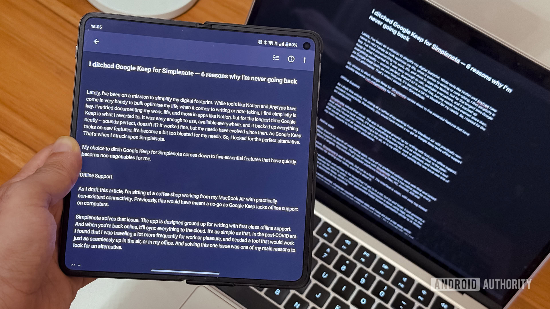
Pillar Four: Simplenote – Unadulterated Text Creation
For writing, drafting, and extended note-taking, the environment must be conducive to deep work. Applications that bombard the user with formatting toolbars, collaborative overlays, and version histories disrupt flow states. Simplenote is the antithesis of the feature-heavy word processor.

Its design philosophy is pure Markdown enablement and distraction-free composition. The interface recedes, leaving the text as the sole focus. While some users might default to Google Docs for collaborative needs, the minimalist ethos often requires decoupling creation from immediate sharing or heavy formatting. Simplenote’s elegance lies in its sparse toolset: tags for organization, and a simple information pane showing word count—a key metric for writers focused on output.
Industry Context and Future Impact: Simplenote’s longevity and cross-platform availability (including desktop operating systems like Windows, macOS, and Linux) cement its role as a stable, neutral ground for text. In an age where proprietary formats and vendor lock-in are concerns, Simplenote’s reliance on plain text or basic Markdown offers a form of digital longevity. This echoes a growing sentiment among advanced users: critical textual data should reside in the most universally readable and least dependent format possible. The application serves as a modern testament to the enduring power of simple text files, synchronized reliably.
Pillar Five: Feedly – Curating the Information Diet
Perhaps the most insidious form of digital clutter is the unsolicited information stream—the endless feed. Modern news aggregators and social platforms are engineered to maximize time-on-site by mixing high-value content with noise, advertisements, and low-signal updates. Reclaiming the information intake process is fundamental to digital minimalism, and Feedly, as a sophisticated aggregator, achieves this through aggressive user control.
Unlike passive consumption apps, Feedly requires an initial investment in curating one’s digital diet. By explicitly selecting trusted sources and organizing them into thematic streams (e.g., specific sub-disciplines within technology, specialized industry reports), the user establishes a high-quality filter. The application then faithfully delivers only what the user has explicitly invited.
Expert-Level Analysis: This application operates on the principle of proactive curation versus reactive consumption. In behavioral economics, the "default option" heavily influences behavior. When the default is an algorithmically driven feed designed for broad appeal (like many mainstream news apps), the user defaults to passive scrolling. Feedly flips this model: the default state is an empty list, and engagement requires the deliberate selection of content providers. This transforms news consumption from an attention-draining activity into a structured research process. While a paid tier exists, the free version is robust enough to enforce this filtering discipline, proving that high-level organization does not necessitate a premium paywall for core functionality.
Synthesis: The Minimalist Toolkit for Intentional Living
These five applications—Google Keep, Niagara Launcher, Microsoft To Do, Simplenote, and Feedly—form a cohesive suite designed to manage the core digital tasks of capture, navigation, planning, creation, and information intake, all while minimizing engagement friction.
The overall trend driving the adoption of such tools is a collective recognition of digital exhaustion. Users are seeking sovereignty over their attention. The industry response, however, remains bifurcated: many companies pursue feature maximization, while a growing segment targets the efficiency of subtraction.
The future of personal technology interaction will likely see greater emphasis on contextual awareness (as seen in Niagara Launcher) and user-defined filtering (as seen in Feedly). As mobile hardware continues to advance, the temptation to overload the interface will only increase. Therefore, the discipline embodied by these simple tools will become less of a niche preference and more of a necessary skill for maintaining mental equilibrium in an increasingly complex technological landscape. The goal is not to disconnect entirely, but to connect intentionally, ensuring that the technology serves the user’s defined objectives, rather than the other way around. This curated approach ensures that when the device is picked up, the interaction is targeted, efficient, and ultimately, valuable.
