
The introduction of Samsung’s One UI, launched in late 2018, represented a significant inflection point in the Android ecosystem. It was a decisive break from the often-criticized TouchWiz heritage—a system widely perceived as sluggish, overly complex, and aesthetically dense. One UI succeeded not merely by improving performance, although that was a crucial component, but by aggressively redesigning the interface around a singular, prescient principle: single-handed operation. This foundational commitment to ergonomics, driven by the inexorable increase in smartphone screen real estate, earned the interface its very name and established a competitive moat for Samsung against rivals still grappling with top-heavy legacy designs. Seven years and eight major iterations later, however, the trajectory suggested by the initial One UI 8.5 beta release indicates a worrying complacency, suggesting Samsung is sidelining the core innovation that defined its success.
The Genesis of Ergonomic Dominance
To fully appreciate the current stagnation, one must revisit the revolutionary aspects of the original One UI philosophy. The most distinctive element was the concept of "reachability zones." Samsung consciously shifted primary navigation elements, action buttons, and key information panels away from the upper quadrants of the display—areas requiring an uncomfortable, often two-handed stretch—down into the lower third of the screen, the domain of the user’s thumb.
This was complemented by an ingenious implementation of "over-scrolling" or "pull-down zones." In core applications like the Settings menu, users could pull the content down past the natural top boundary, bringing elements that traditionally resided near the status bar—such as the search function or top-level categories—into accessible mid-screen positions. This was more than mere visual flair; it was a functional engineering solution to a physical limitation imposed by ever-larger displays. While competitor Android skins continued to operate under the assumption of a mid-sized screen, Samsung addressed the reality of modern phablets head-on. This dedication to thoughtful, human-centric design set a benchmark for the entire industry, forcing competitors to re-evaluate their own spatial design strategies.
The payoff for this early investment was substantial. Samsung devices, often leading the industry in screen size, became paradoxically easier to manage than many of their smaller rivals. For years, One UI represented the pinnacle of large-screen usability, a testament to Samsung’s capacity for ambitious, user-focused overhaul.
The Beta Disappointment: Incrementalism Over Integration
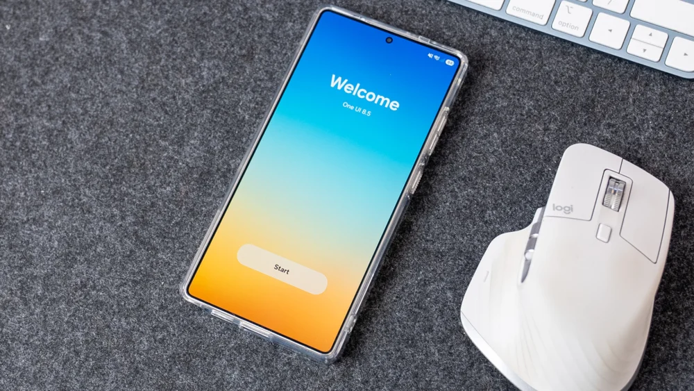
The arrival of the One UI 8.5 beta program, however, suggests that this revolutionary spirit has been muted, replaced by a focus on marginal feature additions and superficial polish rather than rigorous ergonomic refinement. The core issue highlighted by preliminary builds is the inconsistent application of accessibility improvements across the ecosystem, specifically regarding persistent navigation elements like the ubiquitous search function.
The most tangible, yet disappointingly isolated, ergonomic adjustment noted in the beta cycle concerns the Settings application. Samsung has relocated the search icon from its traditional, hard-to-reach top-right corner to a dedicated search bar situated near the bottom navigation area. This is precisely the type of integration that should be celebrated—a direct implementation of the core One UI mandate. The frustration arises immediately thereafter: this critical, thumb-friendly relocation remains exclusive to the Settings app.
Across the vast expanse of Samsung’s proprietary application suite—the Dialer, Calendar, Gallery, and others—the search function stubbornly remains anchored in the upper reaches of the interface. Analysts posit that the perceived excuse revolves around existing congestion in the bottom navigation bars of these applications. Yet, this reasoning falters under closer scrutiny. Examining the Phone app, the bottom taskbar currently accommodates only three primary navigation anchors (e.g., Recents, Contacts, Keypad). Similarly, the Calendar application often dedicates its bottom real estate solely to a prominent ‘Create Event’ button.
The argument that space is insufficient is functionally weak. It suggests a lack of creative willpower to consolidate or slightly reconfigure existing bottom elements. The Dialer, for instance, could easily integrate a discreet search icon adjacent to the primary navigation tabs. The Calendar could reserve space next to the ‘Create’ function for a dedicated search entry point. The failure to universally apply this proven ergonomic fix across core applications signals a worrying breakdown in design standardization. When a fundamental utility like ‘Search’ inhabits different spatial locations and utilizes different interaction paradigms across the system, the user experience fractures, demanding conscious attention rather than fostering the desired muscle memory.
The Quick Settings Conundrum: A Missed Opportunity in Customization
Further evidence of this strategic drift appears in the Quick Settings panel—a critical area for immediate user interaction, often accessed multiple times per session. While One UI 8.5 has ushered in commendable enhancements to this area, allowing granular control over toggle sizing and even vertical orientation for the brightness slider, these improvements stop short of addressing core accessibility anchors.
Specifically, the three essential, non-toggle action buttons—Edit Panel, Settings access, and the Power Menu trigger—remain rigidly fixed in the upper portion of the panel. This placement necessitates a full upward swipe and often a deliberate two-handed adjustment or a challenging thumb stretch, directly contradicting the philosophy that gave One UI its initial acclaim.
This situation is particularly egregious because Samsung has already invested heavily in the underlying architecture necessary for relocation. The system now understands dynamic element placement, resizing, and reordering for the main body of the Quick Settings tiles. If the framework supports the movement of dozens of toggles, the engineering overhead required to permit users to drag and drop the three primary action buttons to a user-defined location—ideally the bottom-right, mirroring Google’s own acknowledgment of thumb reach—is negligible in comparison. The omission suggests a deliberate, albeit misguided, decision to maintain these crucial system controls outside the user’s ergonomic purview. It implies that Samsung prioritizes aesthetic consistency for these three specific elements over functional accessibility for the user.
Industry Implications: The Risk of Feature Parity Over Usability Leadership
This perceived retreat from usability leadership carries significant implications for Samsung’s standing in the fiercely competitive mobile landscape. For years, Samsung’s premium pricing was partially justified by the superior software experience that One UI offered over stock Android or competing OEM skins like Xiaomi’s HyperOS or Oppo’s ColorOS. One UI was not just about feature volume; it was about intelligent feature deployment.
The industry trend, spurred by larger devices, has been a slow convergence toward bottom-heavy navigation, a concept pioneered by Samsung. When the market leader ceases to aggressively innovate on its primary differentiator, it opens the door for challengers. If Oppo or Google Pixel teams decide to focus their next major OS update exclusively on achieving perfect, universal single-handed operation—perhaps through advanced AI-driven context-aware button shifting—Samsung will find itself reacting to an area where it once dictated the pace.
This behavior suggests a potential shift in internal priorities within Samsung’s mobile division. The focus may be migrating toward AI integration (Galaxy AI features) or ecosystem connectivity, areas where immediate, headline-grabbing announcements are easier to generate than the nuanced, long-term commitment required for comprehensive UI refinement. While AI is undeniably the next frontier, sacrificing ergonomic mastery—the bedrock upon which modern Samsung usability rests—is a high-stakes gamble. Software longevity is often determined by the mundane, day-to-day interactions, not just the marquee features.
Future Impact: The Tyranny of Scale and the Need for Iterative Perfection
The physical dimensions of smartphones are unlikely to shrink. Form factors like foldables, which rely heavily on large inner screens, exacerbate the one-handed challenge, even if they introduce new multitasking paradigms. For standard slab phones, the diagonal measurement continues to climb, making the upper reaches of the display functionally dead zones for sustained interaction.
The trajectory suggested by One UI 8.5 implies that Samsung believes it has achieved "good enough" status in usability, allowing development cycles to prioritize new feature introduction over deep ergonomic integration. This is a dangerous complacency. The gap between 95% completion and 100% perfection in UX design is often where brand loyalty is either forged or broken.
What is required for One UI 9.0, or subsequent iterations, is not a superficial visual refresh, but a comprehensive, top-down audit of every core application against the original one-handed mandate. This audit must resolve the inconsistencies:
- Search Uniformity: The search function must reside in the primary thumb zone (bottom bar) across all native Samsung applications, with development resources allocated to optimizing existing bottom bars rather than citing space constraints.
- Quick Settings Liberation: The Edit, Settings, and Power buttons must be movable elements within the Quick Settings customization framework. If the user can move the Wi-Fi toggle, they must be able to move the system access points.
- Consistency in Over-Scrolling: While the over-scroll mechanism is a signature feature, Samsung needs to ensure that secondary menus and modal windows also adhere to lower placement for critical actions, rather than relying on legacy top-aligned controls.
The early success of One UI was built on recognizing a genuine user pain point and engineering a solution that felt innovative and holistic. The evidence emerging from the One UI 8.5 beta suggests that the innovative spirit is yielding to the inertia of maintenance. For Samsung to retain its reputation as the benchmark for premium Android experience, it must recommit to the foundational principle of ergonomic design, ensuring that the interface remains a tool of effortless interaction, not a constant reminder of the device’s ever-increasing physical scale. The small details, in this context, are not insignificant; they are the entire foundation.
